THE BLOG

07
Aug

‘The Water of Life’ — Karuizawa 1960

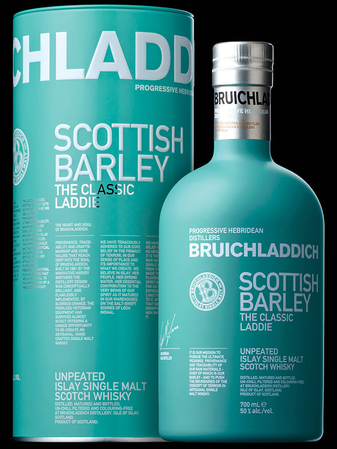
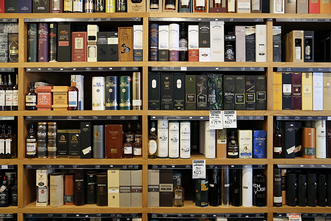
Whilst looking at the whisky market, with exception to a select few, it’s became apparent that world whiskies tend to be more progressive with their packaging. That’s why in this week’s edition of ‘The Water of Life’ we’re journeying to the ‘Land of the Rising Sun’ and looking closer at Japan’s Karuizawa 1960.

karuizawa_bottle1

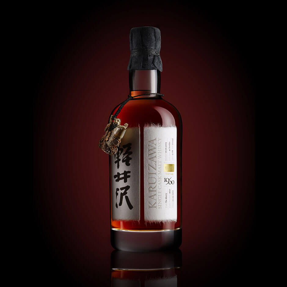
Karuizawa was founded in 1955 as a traditional Japanese distillery using imported Scottish ingredients. When Karuizawa – Japan’s smallest distillery – closed in 2000 its stock of 364 casks was sold to the Number One Drinks Co. In 2006, they began to release single cask bottlings which not only won awards but also a cult following for Karuizawa. So when a single cask laid down in 1960 was discovered, interest from the whisky world was electric. Cask No. 5627 yielded a precious 41 bottles of the oldest and rarest Japanese whisky in the world.

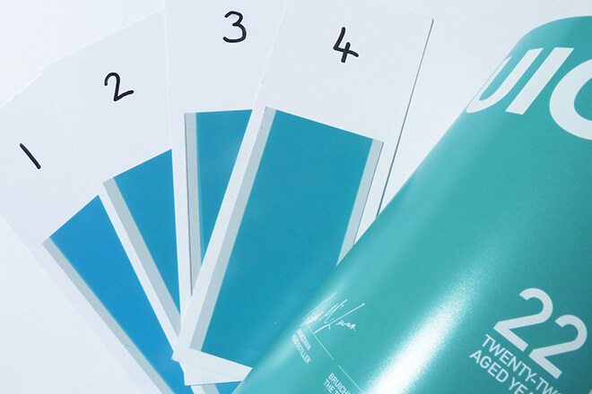
At £12,500 per bottle, (that’s right, the price of a fully kitted Fiat 500,) the packaging solution was required to embody the spirit of the malt for market with the respect, authenticity and individuality that would befit a spirit of such remarkable character and quality.

Following closely to the heritage of this rare spirit, creative articulation pays homage to the language, art and culture of East and West. The reason why there are two labels is to reflect the two cultures that have come together to create the whisky. This story is reflected in the production methods for both bottle and box, where the skills of craftsmen from both Japan and the UK have been blended to create a solution truly unique within the industry. Each bottle and box has been brought to life, testament to considered layers of Eastern and Western artistry.

Karuizawa_detail_3

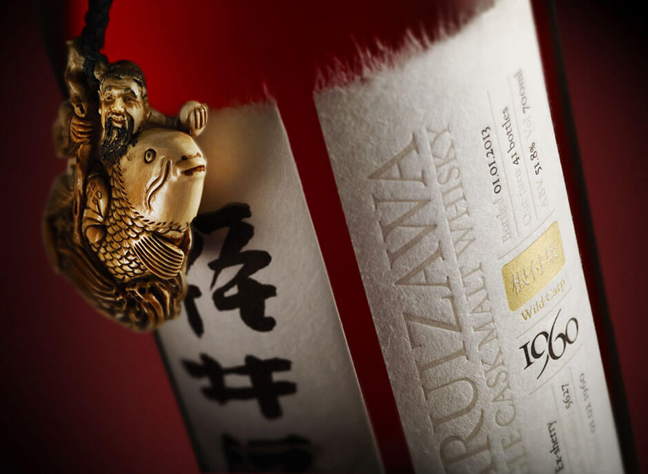
Starting with the fusion of cultures on the bottle labels — the washi paper used was handmade in Japan by Norito Hasegawa — a third generation papermaker, leaving a deckled edge to highlight the composition of the material and an authentic finish.

The Japanese calligraphy on the left is the work of award-winning calligrapher Soji Nishimoto, drafted in to create every label personally. On the right, an effective contrast of print techniques — a letterpress studio from Glasgow has complimented the hand calligraphy with subtle, tactile print finishes. Starting with the embossing for the distillery’s name and finishing with a subtle flourish of hot-foil gold to highlight each specific bottle’s ‘Netsuke.’

Karuizawa60bANONJATTA

What is a ‘Netsuke?’ I hear you ask. Don’t worry, I needed to do a bit of digging myself to find out exactly.

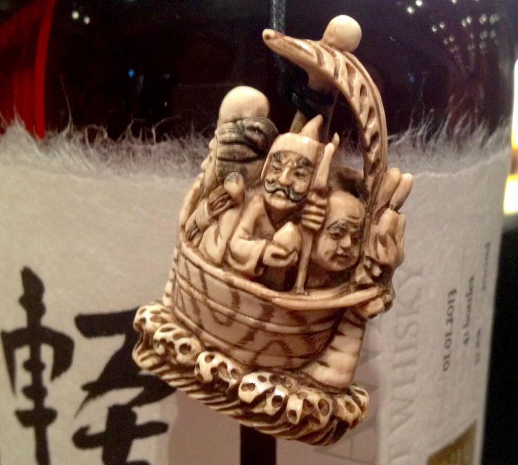
A Netsuke is a miniature sculpture, invented in 17th century Japan which evolved over time into expressions of extraordinary craftsmanship and great artistic merit. As there were only 41 bottles yielded from Cask 5627, the obvious (and boring) choice would’ve been to number them 1-41, but in careful consideration to the whisky’s story, each bottle was decorated with — and named after — its own unique netsuke sourced and selected from a specialist London dealer. This simple consideration to the ‘trivial’ aspect of distinguishing each bottle became a unique selling point for the whisky’s character.

Putting the traditional cherry on the top — the bottle was finished off with a dip in hot, black wax to seal in the cork then wrapped in traditional Japanese cloth

What would be worthy in housing such a rare and fantastic bottle? …a traditional Japanese puzzle box, of coarse.

karuizawa_box2

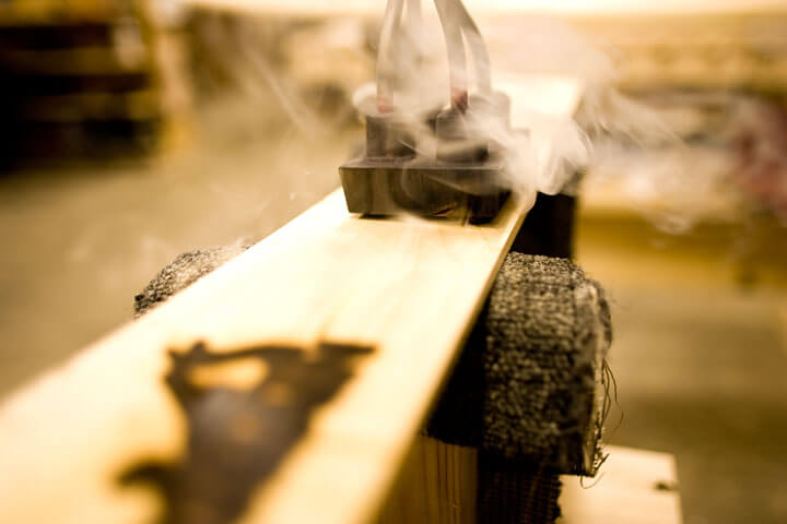
The box was modelled on traditional Japanese puzzle boxes but handmade in England, again fusing east and west. The exterior of the box is made in a lighter wood, the interior in a darker wood: to mirror the cask. Ash for the outer box, because of the detail in the grain – and for the inner box — Wenge, which is naturally dark and gives the impression of a flamed cask. The most special aspect of the box, for me, is that the front of the box is inlaid with actual pieces of the cask  head — which held the whisky in it’s maturation. Another interesting print technique utilised was the hot metal branding used for the Karuizawa kanji, and English translation.

_w3m6925

When it comes to whisky, the packaging finishes (as we’ve been discussing) are extremely important and no more so than when you’re dealing with a malt of such opulence. It would be the accepted norm to just throw the full gamut of expensive finishes at the bottle and call it a day, but what we have here in Karuizawa is an extremely rare and special whisky, framed in an exceptionally considered and successful fashion, only serving to further the whisky’s own unique and special story.

The result of an exceptionally considered packaging solution? …All 41 bottles were sold in advance.

Until next time …

Untitled-1


EAMON CAMERON

designer

A lover of all things print, Eamon brings so much knowledge and creativity to the loft as a designer. He’s at his happiest when sketching away with his favoured 2H pencil and flicking through some paper samples. Not short of a hobby or two, he’s a keen traveller and boasts a full screen printing set-up in his bedroom.

06
Aug

Radical makeover or just a nip & tuck?

One of the biggest considerations in a rebrand is how drastic to go with it. 
Rebranding doesn’t always mean you need to create a new name, logo, message.. fire some staff..  buy a new stapler.. or whatever else you can think of to change that working environment of yours. Sometimes just a little tweak here and there can be enough.

Many brands have revitalised themselves with only simple changes. Take Apple for example, one of the best known brands in the world. They began their life in 1976 known as Apple Computer Co. but as they evolved into new lines of business beyond computers, that name became restrictive. The solution? A quick snip to the nonessential words and the simplicity of Apple was ready for growth.
Not a drastic change – but a significant one.

They have, however, also had their radical makeover…

Please don’t fall off your chair when I show you this.


apple original


This original, too complex logo was scrapped less than a year later. Can you imagine how differently we might view their brand today with this logo? But anyway, that’s a whole new blog post in itself.


apple logos


They then moved on to the lovely apple with the bite missing – with some brash colours to boot, and thankfully in 1998 on to the monochrome versions that we know and love today.

A big makeover is always a risk for any company, but even more so when that company is well-known and well-loved. The timing of Apple’s makeover was perfect – right at the beginning before they were fully established. Just think of the outrage they would cause with a rebrand of a similar level nowadays! A few die hard fans might smash instead of bite that apple.

So Apple have been through the works in the world of rebranding…

A full makeover to kick things off, some polishing of the features, a quick snip of the unwanted and a little wardrobe change to finish.


So, what’ll it be for you? Radical makeover or nip & tuck?

… we can send you a catalogue.


Ruth

Untitled-1

04
Aug

Your Brand Squared – Planning Map

We’ve been busy bees here recently at the loft looking for ways to help our clients plan their design/marketing/brand activities. A lot of the time our clients ask us where is the best place to start? We always say that no brand is perfect and trying to get everything perfect at the same time shouldn’t be your aim. Best to focus on the areas that are most important to help you grow your business…

So we’ve created this map, which precedes our new E-Book ‘Your Brand Squared…’

YOUR BRAND SQUARED BRAND PLANNING MAP

As a rule, we’ve brought it down to 7 easy steps…

1. State your COMMERCIAL GOALS
2. Fill in the BIG IDEA at the heart of your brand.
3. Define the PEOPLE and Relationships that you wish to attract to your brand.
4. Select the best CHANNELS to reach them.
5. Break down the effectiveness of the ELEMENTS of each channel.
6. List those important ACTIVITIES and get going.
7. Don’t forget to MEASURE and hone every activity.

You can download it from…

https://theloft.co/YOUR-BRAND-SQUARED-PLANNING-MAP.pdf

Have fun…

Benedetto

BB

Benedetto is an enthusiastic Creative and Business person.

‘Design with soul’ may be the company tag-line, but to Benedetto, it is also a way of life. He believes that creative and commercial enterprise is about purity of thought, honesty of construction and boldness of execution.

He believes in bringing out the true essence of human endeavour and considers his job of articulating the great work of people and companies an absolute privilege.

His journey has taken him from a career in car design through to his current role as the Founder and Creative Director of the loft, a branding consultancy in Glasgow.

He is honoured to manage a great team, work with great clients and have a lot of fun mixing with so many great people in business.

30
Jul

‘The Water of Life’ — Islay’s Classic Laddie

Continuing to explore the question, ‘Are Scottish whisky companies staying too conservative with how they are branding in an already saturated market?’ I’ve looked at a hell of a lot of whisky and very few have been as impressive as the feature of today’s blog.

One distillery that takes the question posed and flips it on it’s head is Islay’s own Bruichladdich distillery. One word that is at the heart of this Hebridean distillery’s ethos…’Progressive.’

bruichladdich logo 1

“We are proudly non-conformist, as has always been the way in these Western Isles – Oirthir Gaidheal, the Coast of the Gaels, the land of the outsider…we believe in innovation and progress, with constantly striving to produce a more characterful spirit, one with more integrity and provenance, one that is more expressive of this wonderful island we are lucky to live on. A spirit to put a smile on your face wherever you are, and to help you close your eyes and quietly dream of Islay.

We are progressive, Hebridean distillers.”

This ethos is delightfully expressed in the company’s branding solutions and packaging designs. Choosing to express a non-conformist image, in a market classically branded with romantic aspects of the Scottish landscape, is a bold, forward thinking ideal that works in positioning Bruichladdich as one of the most distinguishable brands on the market.

bruichladdich-aqua-islay-sealaddie-22-whisky-colour

Further to the absence of graphics and photography, favouring modern san-serif typographic solutions—one aspect of the distillery’s branding that allows it to occupy this rare position in the market is it’s bold use of colour. It’s not just colour for colour’s sake, it’s a well thought out method in engaging with customers and communicating an important aspect of where the whisky comes from;

“Our blue/green colour – we call it “aqua” – is quite simply the colour of the sea outside the distillery on a bright spring day – we see it a thousand times a day when we look out of the window, and we have never seen the same colour twice. It really is wonderfully enigmatic and fleeting, and we confess to having spent many tens of thousands of pounds in proofing our tins over the years to try and capture that particular shade of aqua exactly – an evocative representation of that capricious light and sea that is such a feature of these Western Isles.”

Singling out just one of Bruichladdich’s packaging solutions to comment on—regarding how they’re using progressive design and print techniques to help them stand out—is difficult as they are all impressive, but there is one range that stands out for me. ‘The Classic Laddie’

Bruichladdich_Scottish_Barley_Single_Malt_Scotch_Whisky

The aqua colour has been used as the main feature in this design, giving the bottle some serious shelf presence. A technique very rarely seen in the drinks industry—the bottle itself has been dipped in a lovely matte coating of the distillery’s famous colour, the rich ‘aqua’ paint adhering to the glass to give it a smooth feel in the hand which emotes luxury. Added to this feeling of luxury is the silver foil used to seal in the bottles cork, a nice contrast of materials. The matte finish of the bottle opposes the shelf norm of shiny glass, helping it stand out in the customer’s periphery.

Furthering this distinctive bottle treatment, the well considered typography has been printed in a matte white spot uv, bold but not over-powering. The type provides a different texture providing a nice contrast to the smooth bottle finish.

bruichladdich-10-yo-13

Progressive print techniques have also been utilised on the range’s tins that house the bottles. They’ve embossed the tin to make a feature of the bold typography—which becomes tangible in the customer’s hand, instilling a feeling of luxury and craft. Other nice touches are they clear spot uv logo emblem—hinting at the distillery’s heritage—which catches light at differing angles. Lastly, the silver foil used for some of the body type—again, providing that hint of class and luxury.

In relation to the question of Scottish distilleries being too conservative, for Bruichladdich, the word ‘conservative’ is obviously absent from their vocabulary. Their story and ethos that leads their bold design choices have truly set them apart from the vast majority of whiskies on the market and I, for one, applaud the results.

Have you seen any Whisky packaging you think I should be looking at or any thoughts on the ones featured? Let me hear your thoughts in the comment section below, thanks!


Eamon

Untitled-1

24
Jul

‘The Water of Life’ — Welcome to Jura

The question I posed and will continue to explore in ‘The Water of Life’ is, ‘Are Scottish whisky companies staying too conservative with how they are branding in an already saturated market? In this edition I’m going to be focusing on an example of how one distillery has challenged it’s branding, managing to stay true to it’s origins but explore it at a more progressive angle in order to set them apart…

In this, the latest instalment of my whisky odyssey, I’ll be transporting you to the mystical Isle of Jura. Nestled off the West Coast of Scotland. It’s only 60 miles as the crow flies from Glasgow but takes a wee while to get there. One road, one distillery, one pub, one shop and one community. It’s often been described as remote and even George Orwell went so far as to say it was ‘the most un-get-at-able place’, whilst he was writing 1984.

Home of the Diurachs, Jura is steeped in rich Scot’s culture, myths, and legends, this small island boasts a distillery producing one of the most revered single malts the country has to offer. Taking it’s name from the land in which provides it’s essential ingredients, I give you… Jura.

In 2013, Jura embarked on redesigning it’s packaging and communications in order to better communicate the company’s brand values, to stand out on the shelves, and—more importantly—showcase their whisky’s distinctive flavour profiles. In this edition of ‘The Water of Life,’ I’ll be looking into just how they did it.


jura_refresh_0


There are four classic bottlings in the Jura Collection, each with their own distinctive flavour profiles: the light and delicate Origin 10; the rich and full bodied Diurachs’ Own 16 year old; and Superstition and Prophecy, which are lightly and heavily peated respectively.

To emphasise each bottles flavour profile, Jura’s progressive branding concept attaches a mythological story from the island’s history. In the case of ‘Prophecy’ the story goes…

‘In the early 1700’s the Campbells of Jura evicted a wise old seeress. Bristling with resentment, she prophesied that the last Campbell to leave the island would be one-eyed with his belongings carried in a cart drawn by a lone white horse. In 1938 it came true when Charles Campbell, blind in one eye from the Great War, led his white horse to the old pier for the last time.’

Just like Jura, Prophecy is a dram that’s steeped in stories, and every drop has a different tale to tell.

So, with the blank canvas of a whisky bottle and box—how have Jura managed to communicate these interesting stories through design?

Simple… same as all great design, with close attention and consideration to detail.

Each carton has its own distinct colour palette featuring a different image, drawn from the landscape of Jura. The image that adorns each carton was art-directed as to connect back to the whisky’s distinct island story and sits beside a half outline of the distinctive Jura bottle shape. When the expressions are lined up together the outlines join up to reveal the whole outline of the iconic Jura bottle. Furthering this concept, each bottle has been attached to a mythical symbol to represent each island legend in just one marque.

For the purpose of the blog and conciseness, I’ll concentrate on Jura’s ‘Prophecy.’


Jura Prophecy-1


Starting with the photograph used for it’s box, the photo shoot’s art director chose the point on the island’s shore where he thought that the Campbell from the story left from, white horse in hand. This photograph is overlaid with the silhouette of Jura’s distinctive shape and a classic touch of metallic foil to add some luxury to the box.

Moving on to the bottle itself, there are a lot of interesting finishing techniques that have been harnessed to communicate the single malt’s story.


Jura (7)

I’ll start with the most important, and my personal favourite aspect. It’s the mythical symbol. The eye has so much power in it and brilliantly prefaces the mythical story. For me, It’s the finish used that propels it in front of all other aspects. The metallic symbol has been cast onto the bottles glass—a very very forward-thinking solution in the realms of whisky packaging—infusing the metal with the glass in the same way that the story and mythology is fused with the history of the island. The raised relief of the symbol makes it tangible and adds a very luxurious feel to the overall bottle.

3D EMBOSS

This look is carried on to the bottles box, with the symbol being three-dimensionally embossed on the card. No small feat in consideration to production, the emboss is created using a heated roll-press which the box passes through a male/female die, the heat and pressure work in unison to create the depth of relief. Details of this mysticism are also brought into the tone of voice of the copywriting present on the box.

Coupled with the bottle’s understated glass embossing, hot foiling (see last blog), and metallic labelling, all aspects come together to successfully communicate Jura’s story.

As I think you’ll agree, all these design factors combine to allow Jura whisky to inhabit the more progressive and recognisable end of the spectrum when it comes to the overwhelming selection of Scottish whisky designs on our shelves.

Stay tuned to this blog in the coming weeks where I’ll be looking deeper into the whisky industry and showcasing brands using design and print finishes in interesting ways to set their fine malts apart from the rest.


Eamon

Untitled-1

23
Jul

Nailed it.

In my last blog post, I spoke about how a rebrand can go wrong. So in this one, I’ll be a bit nicer and focus your attention on when things go right. I don’t want to scare you off the idea of a rebrand, after all.. I’d be out of a job.

To put it simply, a rebrand isn’t just creating a new logo that looks nice and putting it all over your company.. it’s about discovering what message you want to deliver –  cleverly incorporating that into a logo and continuing to deliver it throughout every element of your pursuit.

The most recent rebranding of More4 created one of my all time favourite brands.

more 4 logo

My oh my.
Feast one’s eyes.

I’m well known in the studio for my love of all things geometric, so it’s obvious why I have a soft spot for this wee dreamboat.
Besides the look of it though, this rebrand perfectly demonstrates how to get a message out there.
More4 was becoming more of a ‘lifestyle’ channel, with content showing us how to be creative – restoration.. fashion.. cookery.. and the previous logo wasn’t standing well alongside this.

old more4

It’s still a good-looking logo, it was a bold and uncompromising brand that worked with More4’s original, more ‘grown up’ content and ambitions, but the shift in the content of the channel cried out for a new look.

Alongside this new style of content, More4 had an upcoming launch of a ‘scrapbook’ service, where viewers could go online to ‘cut out and keep’ their favourite ideas from the shows.
The rebrand also pulled from this upcoming service to adopt its ‘flipping’ movement style – resembling flipping through the pages of a book.

more 4 flip

This style is best seen in action:

The studio behind the rebrand, ManVsMachine, perfectly summed up the importance of consideration at all times of how a brand will be used;

“When we’re designing for a TV channel, we design a logo with a vision of how it’s going to move. It’s used as a still logo 10% of the time at most”

This understanding on movement plays a huge part in the beauty of this logo – even in the flat logo, the clever placement of shadows and highlights almost entices the viewer to flip over each 3D segment. This urge to get hands-on with it clearly hit the studio creators too, as they teamed up with Jason Bruges Studio to physically build and implement their little flippers in real locations..

These beautiful idents lovingly portray the ‘making things’ ideology behind More4’s new creative path. I take my hat off to everyone behind them for actually getting out there and doing it instead of computer generating all the magic – it really implements what the brand is all about.

The freedom the logo has to move, to be alive, to create a new look every time, ties in absolutely with More4’s new focus on creative content and the exciting array of colours also awakens creativity and imagination.
All in all – it’s an example of a foolproof rebrand that tells the story it’s supposed to tell.

Next in line is the ITV rebrand..
(this tv channel theme is unintentional)

itv rebrand

This project followed some major re-organisation at the network, there were big changes staff wise and therefore approach wise. Their ambition was to turn ITV Creative into a respected, award-winning agency, starting with their own on-air content.
ITV provides hugely popular content that brings all sorts of people together, this stream of popular culture influenced the need for a more friendly logo. The soft, cursive font is more inviting and lively – the previous logo looked stagnant and boring.. definitely not that of a directional tv channel.

The more ‘fun’ approach to the logo however, was met with some debate over how it will deal appropriately with more serious content, such as the news..

itv news
..I think it deals with it just fine.
Using only one spot colour gives it a more sombre appearance, but still keeps that soft, inviting appearance.
Not all news is bad news!

A big factor of the rebrand included the task of cementing the relationship in viewers minds between the shows and the ITV brand that produces and broadcasts them.

The solution to this is my favourite part of the brand..

itv 1

itv 2

The on-screen logo will adapt to the tone and colour scheme of the footage being promoted using a ‘colour-picking’ feature.
This creates a brand which proudly shows the network’s content – fusing with the imagery to fit comfortably alongside the particular show rather than overpowering it.
The colours used in the main logo are picked from all over the spectrum, to hint at the ever evolving and adaptable colour scheme.
It works even better when seen in motion..

Lovely.

Both examples I’ve spoken about here have nailed the rebranding process.
How have they done it? Simple; they haven’t just slapped a new logo all over the place, they’ve put that all important message all over the place.


Ruth

Untitled-1

22
Jul

The risky business of a rebrand.

A rebrand is defined as ‘the creation of a new name, term, symbol, design or combination thereof for an established brand with the intention of developing a new, differentiated identity in the mind of consumers, investors and competitors.’
The final 8 words in that definition are the absolute key to a successful rebrand and should be cemented in the minds of all involved in the identity overhaul.

Of course a company has to be happy with the way they look but an element of self-forgetting needs to happen during the process to think about your customers; existing customers who already love you for what you are.. will they turn their back on you when you change what they’re familiar with? potential customers who have never noticed you amongst the competition.. could you grab their attention with this new look?
With a rebrand done correctly, you don’t have to make a choice – you get to keep your already existing customers while attracting new ones.

With a rebrand gone wrong, however – you get neither.
It’s a sad moment when a company releases their exciting new look and you feel more baffled than impressed.
Like most things in life, it’s all down to taste and opinion – you can’t please all of the people all of the time, as they say – but there are times when it goes monumentally wrong and you don’t please any of the people any of the time.
You may be thinking that’s a bit drastic but when I show you this example from GAP you’ll understand…
gap rebrand

…got it?
A perfect example of ‘if it ain’t broken, don’t fix it’.

I do commend their bravery in attempting a drastic change of such a well known, loved brand but I do not commend their outcome. I’m not alone on that either – the rebrand was received with very tightly crossed arms.
That tall, serifed and handsome font replaced by the ever conventional Helvetica.. that beloved blue square shrunk and dropped clumsily on the end.. and don’t even get me started on that gradient.
The widespread less than impressed reaction resulted in GAP performing the fastest branding turnaround of all time – reverting back to the original in just 6 days.

There comes a risk with any rebrand – depending on the scale of the company whether that risk is a big one or a colossal one – to increase your chances of coming out the other end of that colossal task with a smile on your face and a fat wallet, always remember to keep your customers at the forefront of any decision.
Think why they fell in love with your company in the first place – they love your goals, message and culture – your identity puts a face on those things. They get familiar with that face, they trust that face. Then you go and change that face..  that makes them worry what else has changed.. are you still the same on the inside?
That question is the crucial element in a rebrand. It’s not about just changing a logo, it’s about taking what’s on the inside, taking a company’s ethos and carrying them forward – interpreting them in a beautifully designed identity.

…you just need the right design company for that. *hint hint, nudge nudge*


Ruth

Untitled-1

22
Jul

‘The Water of Life’ – a deeper look into whisky.

Picture the scene — you’re standing in a whisky shop, tasked with selecting a fine malt to enjoy with friends over the weekend, their enjoyment rests on your shoulders. What to choose? The vast walls of options are dizzying and your knowledge of whisky is left wanting.

nicks-selection

So, what one do you choose?

Stripped back to the core element, the alcoholic yellowy-brown liquid is merely a concoction of fermented grains, distilled and aged in some sort of wooden cask. But — and it’s a big BUT — whisky is so much more than just that. It’s about how the company has crafted their blend, heritage and most importantly, their story.

Your choice? Still undecided?

It’s at this moment where Whisky companies are at battle for your attention — and the weapon of choice for the battle is, great design.

The designs for whisky labels/bottles/packaging are crafted to communicate the companies story and what the customer can hope to experience with that company’s specific mix.
So, how do they do that?

It all starts with extensive research, this is where the hard work is put in by designers in order to successfully communicate, exactly, the whisky’s character and narrative. Here I’ll feature a few companies who I feel have hit the mark with how they’ve handled the task, and comment on what techniques they’ve used in order to successfully communicate their message.

What I wonder, and what i’ll challenge in this blog, is… are Scottish whisky companies staying too conservative with how they are branding in an already saturated market? Over the weeks I’ll feature examples of how interesting design and print finishes can set a Scottish whisky apart from it’s competitors.

I’ll be starting with a feature on the fine examples created by the Knockdhu distillery in Knock, Aberdeenshire. AnCnoc is the distillery’s range of aged single malts, each boasting an eye-catching and progressive bottle and canister design.

anCnoc whisky

It is the range’s minimal packaging style that sets them apart from the crowd. Whilst browsing shelves upon shelves of whiskies with conservatively styled labelling, this style certainly catches the eye.

So, what makes these designs successful?

Out with the lovely treatment of type and the subtle use of colour, for me, it boils down to three important aspects; the choice of material used, the subtle illustration, and the print finish.

Starting with the choice of material — the paper stock chosen for both the canister and the bottle labelling, has been carefully considered so that it communicates quality. Getting hands-on with the packing is the customer’s first physical interaction with the product and an instant feeling of quality is generated whilst running your hand across the premium texture of the paper. You can see the subtle texture of the paper in this close-up image…

photo 2
Secondly, the lovely illustration of the Knockdhu’s grassroots distillery, present across the full range, works well in subtly communicating where the whisky is coming from. It gives a sense of the whisky’s Scottish heritage but in a completely non-intrusive manner.

Thirdly, and most important in the purpose of this blog, is the the print finishes used on anCnoc’s packaging. A hot trend in whisky packaging at the moment is foil-blocking, a method in which a heated printing press adheres a metallic finish to the paper. This finish gives an instant touch of class to the packaging, communicating the brand’s consideration of quality. AnCnoc employs the foil-block finish in a very understated fashion, using it to effectively highlight the most important parts on the label. Furthering the feeling of quality generated by this print finish, the die which adheres the foil also leaves a letterpress style finish, leaving the elements of foil slightly embossed, creating tangibility in the illustration and typography.

anCnoc hot foil

As I think you’ll agree, all these design factors combine to allow anCnoc whisky to inhabit the more progressive and recognisable end of the spectrum when it comes to the overwhelming selection of Scottish whisky designs on our shelves.

Stay tuned to this blog in the coming weeks where I’ll be looking deeper into the whisky industry and showcasing brands using design and print finishes in interesting ways to set their fine malts apart from the rest.


Eamon

Untitled-1

12
Jun

Welcoming CHRIS NEWTON

Hello all…

We are delighted and very lucky to be welcoming talented Design Superstar Chris Newton to the loft for his internship.

photo 4

As is common practice. We thought we’d make him feel right at home by putting him directly under the spotlight and firing a load of questions at him…

Name? Chris Newton

Date of Birth? 07/08/87

College? Clyde College

Favourite Piece of Loft Work? (Only kidding, don’t answer that…)

Favourite Designer and why? Steven Simpson – ‘The good man inspired My Day of the Dead Website.’

Favourite Design Tool? It’s all about InDesign and pink pens.

Favourite Font? BEBAS

Tea or Coffee? Coffee please 🙂

Favourite Studio Music? The Black Keys or The Kills or The Yeah Yeah Yeah’s. Anything on X-FM really!

What do you want to be when you grow up? An Adult…

Chris has thrown himself right in at the deep end here at the loft. We look forward to working with him and getting to know him better…

Check his exceptional work out at http://chrisnewtondesign.co.uk

16
Apr

COMING SOON!!

We’ve been updating our portfolio recently & boy have we been busy! Lots and lots of lovely new projects to get excited about. Each one, a big, beautiful idea brought to life in the most imaginative way possible…

You can see them by checking out our site…

What’s even more exciting is that we’re just warming up…

coming soon

Coming Soon!!