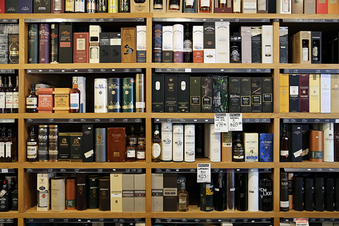
Picture the scene — you’re standing in a whisky shop, tasked with selecting a fine malt to enjoy with friends over the weekend, their enjoyment rests on your shoulders. What to choose? The vast walls of options are dizzying and your knowledge of whisky is left wanting.
So, what one do you choose?
Stripped back to the core element, the alcoholic yellowy-brown liquid is merely a concoction of fermented grains, distilled and aged in some sort of wooden cask. But — and it’s a big BUT — whisky is so much more than just that. It’s about how the company has crafted their blend, heritage and most importantly, their story.
Your choice? Still undecided?
It’s at this moment where Whisky companies are at battle for your attention — and the weapon of choice for the battle is, great design.
The designs for whisky labels/bottles/packaging are crafted to communicate the companies story and what the customer can hope to experience with that company’s specific mix.
So, how do they do that?
It all starts with extensive research, this is where the hard work is put in by designers in order to successfully communicate, exactly, the whisky’s character and narrative. Here I’ll feature a few companies who I feel have hit the mark with how they’ve handled the task, and comment on what techniques they’ve used in order to successfully communicate their message.
What I wonder, and what i’ll challenge in this blog, is… are Scottish whisky companies staying too conservative with how they are branding in an already saturated market? Over the weeks I’ll feature examples of how interesting design and print finishes can set a Scottish whisky apart from it’s competitors.
I’ll be starting with a feature on the fine examples created by the Knockdhu distillery in Knock, Aberdeenshire. AnCnoc is the distillery’s range of aged single malts, each boasting an eye-catching and progressive bottle and canister design.
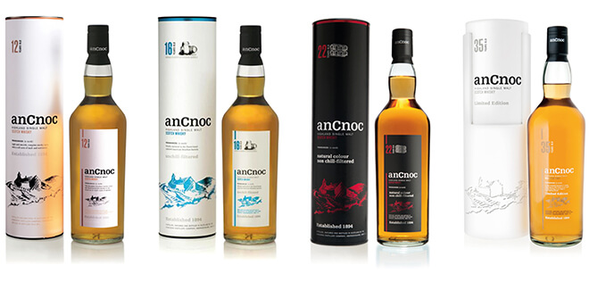
It is the range’s minimal packaging style that sets them apart from the crowd. Whilst browsing shelves upon shelves of whiskies with conservatively styled labelling, this style certainly catches the eye.
So, what makes these designs successful?
Out with the lovely treatment of type and the subtle use of colour, for me, it boils down to three important aspects; the choice of material used, the subtle illustration, and the print finish.
Starting with the choice of material — the paper stock chosen for both the canister and the bottle labelling, has been carefully considered so that it communicates quality. Getting hands-on with the packing is the customer’s first physical interaction with the product and an instant feeling of quality is generated whilst running your hand across the premium texture of the paper. You can see the subtle texture of the paper in this close-up image…
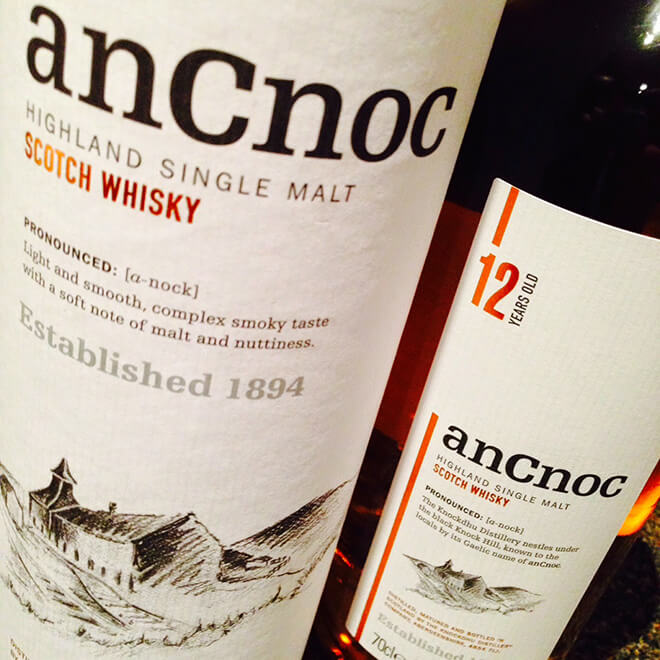
Secondly, the lovely illustration of the Knockdhu’s grassroots distillery, present across the full range, works well in subtly communicating where the whisky is coming from. It gives a sense of the whisky’s Scottish heritage but in a completely non-intrusive manner.
Thirdly, and most important in the purpose of this blog, is the the print finishes used on anCnoc’s packaging. A hot trend in whisky packaging at the moment is foil-blocking, a method in which a heated printing press adheres a metallic finish to the paper. This finish gives an instant touch of class to the packaging, communicating the brand’s consideration of quality. AnCnoc employs the foil-block finish in a very understated fashion, using it to effectively highlight the most important parts on the label. Furthering the feeling of quality generated by this print finish, the die which adheres the foil also leaves a letterpress style finish, leaving the elements of foil slightly embossed, creating tangibility in the illustration and typography.

As I think you’ll agree, all these design factors combine to allow anCnoc whisky to inhabit the more progressive and recognisable end of the spectrum when it comes to the overwhelming selection of Scottish whisky designs on our shelves.
Stay tuned to this blog in the coming weeks where I’ll be looking deeper into the whisky industry and showcasing brands using design and print finishes in interesting ways to set their fine malts apart from the rest.
Eamon
Comments ( 0 )