THE BLOG

29
Aug

Is There Method To This Madness?

Hello, you lovely design people! It’s been a while since I’ve posted on here and felt it was time to start flexing my linguistic muscles once again. We have been doing a lot of brains forming in-house recently — from developing exciting new brands from scratch to shaping the future for existing companies — all if which requires idea generation.

And what do you know, that brings me right to the main topic I would like to talk about: what is the most effective process for coming up with amazing ideas?

Below you will find our tried and tested route that we find works best. There are of course many external factors at play during a project, but this process keeps us grounded and allows ideas to flourish — always crucial at the initial stages of any project. The method to our madness:


1. Truly understanding what you’re trying to communicate

How could one generate new ideas based on something they have no idea about? Ridiculous, I know, but chocolate teapots aside, having a deep understanding of the requirements, requests, and responsibilities is key to developing a killer idea. A dear friend of mine, Abraham Lincoln, was right to say, “Give me six hours to chop down a tree and I will spend the first four sharpening the axe”. Ask as many questions as you need, or ask as many as you feel is socially acceptable — whichever comes first.


2. Start with the words

Once our brains are stuffed to the brim with knowledge of the task at hand, we move onto refining the language that surrounds the requirement. This involves chopping up meeting notes, re-reading initial emails, and honing in on the first bright sparks that come to mind. We find brainstorming can signpost potential directions for projects, which later develop into themes.


3. Move on to mind mapping

With ideas ripe and ready for the picking, the mind mapping process allows us to delve deep into our subconsciousness and connect the dots. It’s important to start very broad and general with mind mapping — sometimes you can find yourself putting pressure on linking these ideas back to the brief’s final outcome. But by starting wide and honing in nearer the end it grants us the ability to develop ideas that would never have been available with a narrow viewpoint. Also, as we are visual creatures; the endpoints of our mind map are most effective when they are nouns, as this is something we can visually represent.


4. Researching key terms

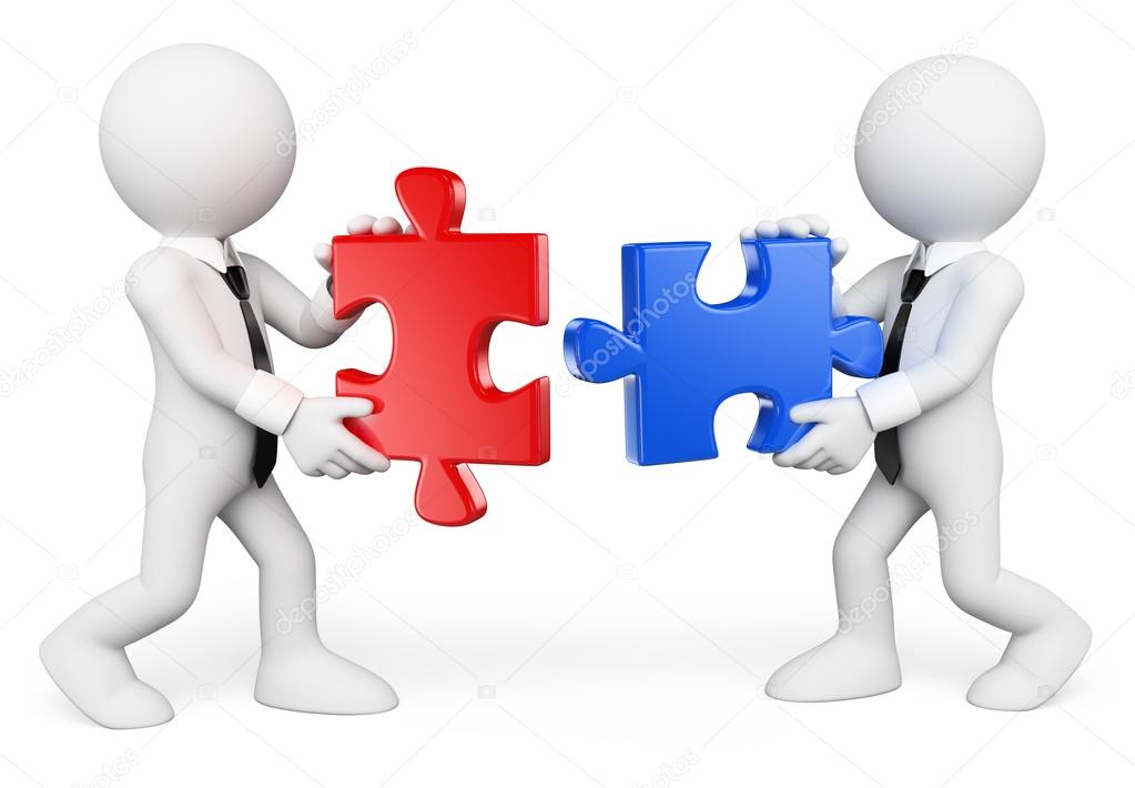
After some group discussions and along these ideas to soak in, we then select some key terms that become apparent on the mind maps. We take inspiration from books, artwork, and online research. Initially, we find it most effective by staying away from similar outcomes (be that a logo for example) and focus more on literal representations of the key terms. And if anyone uses a ‘Stock_3D_business_people_putting_puzzle_pieces_together.jpg’, they’re fired (see image above for reference, you heathens).


5. Reflecting on research imagery

A core part to idea generation is joining the dots — seeing the emerging patterns in the research and deciding which is most fitting for the brief. I previously mentioned that it was initially most effective to not link back to the brief’s final outcome — but now is the time to do so. Moving away from the wide and honing in on particular parts of the research that fit the brief’s message. These groups are what form out themes.


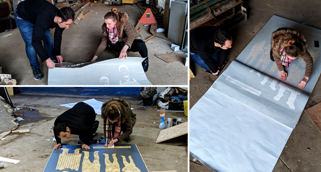
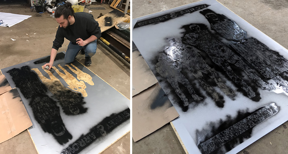
6. Thumbnailing the themes

Time to start drawing. Putting pen to paper and making some initial marks gets the creative juices flowing. It’s always a good idea to keep things rough and loose, unrestricted and free from too much control. I personally find it most effective if I continue sketching multiple ideas inspired from the research imagery until I can’t see it from any other angles. At that ‘burn-out’ point it’s time to take a step back and review.


7. Breath and refine

Go on, grab a cup of coffee, take 5, and give your brain a breather. Fresh eyes unclog the mind and open up a new perspective on some of your design choices. Upon reflection of thumbnails, we like to select the ones that are working well and have potential, before refining these ideas with help from our research and words taken from the brief.


8. Rinse and repeat

Continue developing and refining these thumbnails until you are confident in a selection of ideas. It’s never smart to propose a design that you don’t feel works just to please the client because the client will always choose this one. Survival of the fittest I say, let the thumbnails battle against one another until a brilliant (and slightly intimidating) group of ideas have formed.


9. Digital development

Only after the intense labour of love for our thumbnail sketches is over will we then move onto the computer. We feel it’s good to see the computer as a tool, instead of a creative outlet (an expression that is engrained from college lecturers). Paper and pencil are quick, loose, and unrestricted — and although it may seem faster to just jump on a computer, the process will take much longer if not executed properly. A lot of the time we will send our clients refined sketches before moving onto the computer, just to really nail the initial idea.

Our process is always changing as we learn and adapt to the current design climate, but it’s something we use on a day to day basis. It makes even the most ambitious projects much more manageable and exciting, no mean feat!


Alongside this process list, we want to share some top tips on idea generation, you lucky devils you:

  • A lot of idea generation is simply finding links between existing ideas
  • Recreate literal objects in interesting ways which tie together multiple messages
  • Always start broad and work your way back in
  • Take inspiration from absolutely anywhere, not just Pinterest…
  • Breaks are important
  • So is coffee
  • Don’t be afraid to explore the unknown, that’s where excitement lives
  • Fall in love with your ideas

Alas it’s time to conclude the chronicles of idea generation. Go forth and shower all projects with wonderful and weird ideas. Now with numb fingers, I bid you farewell, but I’m sure we’ll speak again very soon…

Reiss, Designer & Director of Client Happiness.

staff_170502_0542

Reiss is a multi-purpose designer with a broad range of skill-sets.

He loves being a part of any creative activity — whether it’s mapping out a user experience, getting his hands dirty with some copy or even re-building bits of his motorbike.

A born people-person, Reiss is never happier when showcasing ideas from his vividly wild imagination and working with clients to see them through to completion. Once an architect, he has a keen eye for conceptual ideas and never tires of learning new things.

16
Aug

Let’s Get Social

Social media platforms definitely like to keep us all on our toes. The constant changing of image sizes and algorithms make it hard to keep up. So to make sure you stay on top of your social media game we have put together a handy Social Media Cheat Sheet (yours to download and keep — and don’t worry it’s printer friendly) that contains all the latest sizes, best times to post, and a little top tip thrown in there for good measure. In this blog post, we’re going to break down each platform and delve into each section of the cheat sheet to give you some extra information.

Twitter
Starting with Twitter, our most social of the platforms. Focussing on creating a community, engaging with your customer, and keeping the sales advertising to a minimum is the best way to approach this platform. Giving behind the scenes access or sharing information that is valuable to your customer are great ways to build a personality for your brand.

The best days to post on this platform are during the working week (Monday – Friday) with people being most active during their lunch hour through to the afternoon (12.00 – 15.00). Another great time to post is around 17.00 when people are likely to be commuting home from work looking for some post-work light relief.

When sharing images the best size is 1024 x 576px. While the desktop version can support square images, the mobile app chops your images into a rectangle shape so keeping to this aspect means that no important information will be lost when sharing on mobile.

Top Tip: Brand Recognition Through Hashtags
Creating a branded hashtag is a great way of tapping into user-generated content and engaging with customers easily. This means you won’t miss any tweets related to your brand if they only use the hashtag and not your company’s Twitter handle.


Example: Alzheimer’s Research UK uses the hashtag #sharetheorange to not only create awareness of their campaign but to collate user-generated content that they can retweet and share on their own social media channels.


Facebook
Next up it’s a social channel that most of us are very familiar with; Facebook. With so many people and businesses across the world using this platform, it really is a must have for any business.

The best days to post on this platform are during the working week (Monday – Friday) with people being most active between 09.00 – 15.00 (when most people should be working — but we will keep that between us). By posting between these times, it gives your content a good chance to be seen throughout the day and ready to hit that key sharing time (18.00).

So now that you know when to post, let’s talk about what to post. For Facebook, the best size to use for posts in 2000 x 2000px. This gives you more vertical real estate making your images a greater chance to be seen and clicked on when scrolling through the newsfeed.

Top Tip: Human Stories
People like people. So whether it’s a member of your team raising money for charity, somebody making a great contribution to the company, or even a birthday celebration — let your viewers get to know the people behind the brand for maximum engagement.


Example: Our ‘Meet The Team’ campaign last year featured each team member and a few of their favourite things. This allowed our followers to gain an insight into the people behind the designs. Using a short gif made the post visually interesting and helped keep viewers engaged for longer.


Instagram
Now for our most visual platform — Instagram — where your images really do the talking. Whether you are using photography, graphics, or video, this platform is a great place to promote your brand and it’s personality.

Engagement on Instagram is pretty constant throughout the week with Sunday being the only day that can see a slight dip. Again, commuting times (07.00 – 09.00 or 16.00 – 18.00) and lunch times (11.00 – 13.00) come out best for engagement so you want to have your post ready to hit these key times. With video engagement on the rise, the best time to post these is before 21.00.

Instagram has been pretty constant with its image sizes, with the standard size being 1080 x 1080px remaining unchanged since the platform launched. They now offer portrait and landscape alternatives, but square still remains the most popular.

Top Tip: Use Hashtags Quickly & Effectively
Keep a pre-organised list of hashtags that relate to your content in your emails or on your phone so they can quickly be copied and pasted into the comments section. You’re allowed a maximum of 30 hashtags per post.


Example: At the loft, we keep between 15 – 20 key hashtags saved in the notes section on our phones. This means when we post a new image, we can quickly copy and paste the relevant hashtags into the first comment of the post. Putting the hashtags into the comments section rather than including it in the caption ensures that the post doesn’t look messy.


LinkedIn
And last but certainly not least, the business heavyweight; LinkedIn. Professional and a great way to make some key B2B connections, LinkedIn is the perfect place to show off your expertise.

With work on the mind, the best days for engagement are between Tuesday and Thursday once again with commuting times (07.00 – 08.00 or 17.00 – 18.00) being the best time to post. Avoid between 22.00 – 06.00 when engagement will hit a lull.

Like Facebook, posting square images gives you more vertical real estate on the LinkedIn newsfeed and luckily using the same post size (2000 x 2000px) works perfectly. This will make your post stand out while the image quality remains high on both desktop and mobile.

Top Tip: Educate & Delight
Infographics are 300% more likely to get shared than any other content. Label each infographic with your LinkedIn page as the source so viewers can easily find your page.


Example: GE Renewable Energy used an infographic to explain the benefits of their product quickly and easily to their customers. Keeping it simple and highlighting key details makes the infographic effective and it definitely attracted attention with over 400 likes in just one day.

We hope this blog post has unravelled some of social medias greatest mysteries. Is your media in need of a refresh? Let’s get social, find us on all good social media platforms @tlcstudios.

Laura, Designer & Director of Noise

Laura

Miss Noisy! The team’s very own socialite and one who masters every situation she finds herself. Laura is the lady for every occasion. She has a formidable array of skills as a creative, diplomat, agony aunt, blogger, Tweeter, art-director, team player and our own favourite — noisemaker. A more perfect dinner companion, you will be hard-pressed to find.

13
Aug

Tradeshow Banner With A Difference

At the loft we love a challenge, so when the Violence Reduction Unit Scotland came to us and needed a unique, bespoke tradeshow banner in 48 hours we rolled up our sleeves and got to work. As part of the Police Scotland, the Violence Reduction Unit Scotland was formed to target all types of violence — ranging from gang fighting to domestic violence to bullying in the workplace and schools. The work they do is incredible and we have had the pleasure of working with them over the past year.

VRU Scotland didn’t want a pull-up banner, they really wanted something bespoke, that was in keeping with the graffiti visuals we had created for them. With this in mind, we came up with a few alternative ideas to the traditional tradeshow banner. In the end, it involved some MDF, vinyl and a whole lot of black spray paint. And here is how we did it.


VRU_1

1. Vinyl & Vans

The tradeshow banner was for one of their projects, Street & Arrow. This project hires former offenders for twelve-month blocks. During that time workers are paired with a mentor who can help them master everything from basic employment skills like time management to managing money and relationship issues. The design we went with included the Street & Arrow visual which features a man taking his hoodie off to reveal a chef’s uniform. This visual comes with a double-take message on perceptions.

In order to get the Street & Arrow visual on to the MDF board, we decided to use vinyl as a stencil. First we started with creating the artwork and sending it off to a printer who was able to get the vinyl cut and ready for us the next day. Next, came the problem of working out how we were going to transport a 2-metre tall piece of MDF to the warehouse (where we were going to create the tradeshow banner) and back — introducing the van.


VRU_2

2. Prime & Prep

Van hired, vinyl collected and MDF bought, early the next day we headed to a warehouse to get started. Before we could apply the vinyl we needed to prime the wood. For this, we used two coats of clear primer. This took the better part of the morning as each coat needed a good few hours to dry. Once they had dried we applied the vinyl. This part of the process was the most delicate and had to be carried out slowly. Starting at the top and only applying a small section at a time, we smoothed the vinyl so that there was no bubbling. To ensure this we got inventive and used a credit card to smooth each section. Before peeling off the outer layer of the vinyl to expose the stencil we sprayed the board lightly with water to make it easier to remove.


VRU_3

3. Spray & Reveal

Vinyl applied and ready, it was time to spray paint. One bit at a time we covered the full stencil in black spray paint ensuring we kept an even coverage across the whole design. While we waited for the spray paint to dry we went for a quick donut and coffee stop. Feeling re-energised it was time for the big reveal, after double checking that the paint was dry, we removed the vinyl stencil piece by piece to expose the final design.


VRU_4

4. Display & Deliver

Next, we attached a fixing to make it stand. To make it easy to transport we went for a photo frame style stand. Now at the loft, we love any excuse for a couple of photos so after we finished posing with the completed tradeshow banner, it was time to put the banner carefully back into the van ready to be delivered to the client early the next day.

Creating the tradeshow banner was a whole lot of fun, the client was really happy with how the banner turned out and Reiss got to fulfill his lifetime dream of driving a van!

Laura, Designer & Director of Noise

Laura

Miss Noisy! The team’s very own socialite and one who masters every situation she finds herself. Laura is the lady for every occasion. She has a formidable array of skills as a creative, diplomat, agony aunt, blogger, Tweeter, art-director, team player and our own favourite — noisemaker. A more perfect dinner companion, you will be hard-pressed to find.

04
Aug

‘Designers-With-Soul’

At the loft we’ve been working with MCR Pathways for a number of years now.

For those that aren’t in the know, MCR Pathways are an incredible charity that exists to ensure that ‘every disadvantaged young person in Scotland, gets the same education outcomes, career opportunities and life chances as other young people.’

They mainly do this by providing supportive mentors who meet the young person for one hour each week at their local high schools.

In the past, the loft has provided creative support and work-experience opportunities to the charity. However, amazing designers Reiss McLeod and Laura Campbell have taken this not one but several steps further. They’ve passed their exams, did their training and are now fully-fledged mentors. Pictured here in their favourite haunt (Paesano Pizza,) they will both commit one hour a week to help their mentees create a better life for themselves. An absolutely wonderful commitment!

They meet their mentees in a few weeks time and are incredibly excited to help a young person as well as make a contribution.

‘Designers-With-Soul’

We salute you both…

If you would like to help a young person and want to get involved in mentoring, please check out… http://mcrpathways.org