Category: Print

30
Jul

‘The Water of Life’ — Islay’s Classic Laddie

Continuing to explore the question, ‘Are Scottish whisky companies staying too conservative with how they are branding in an already saturated market?’ I’ve looked at a hell of a lot of whisky and very few have been as impressive as the feature of today’s blog.

One distillery that takes the question posed and flips it on it’s head is Islay’s own Bruichladdich distillery. One word that is at the heart of this Hebridean distillery’s ethos…’Progressive.’

bruichladdich logo 1

“We are proudly non-conformist, as has always been the way in these Western Isles – Oirthir Gaidheal, the Coast of the Gaels, the land of the outsider…we believe in innovation and progress, with constantly striving to produce a more characterful spirit, one with more integrity and provenance, one that is more expressive of this wonderful island we are lucky to live on. A spirit to put a smile on your face wherever you are, and to help you close your eyes and quietly dream of Islay.

We are progressive, Hebridean distillers.”

This ethos is delightfully expressed in the company’s branding solutions and packaging designs. Choosing to express a non-conformist image, in a market classically branded with romantic aspects of the Scottish landscape, is a bold, forward thinking ideal that works in positioning Bruichladdich as one of the most distinguishable brands on the market.

bruichladdich-aqua-islay-sealaddie-22-whisky-colour

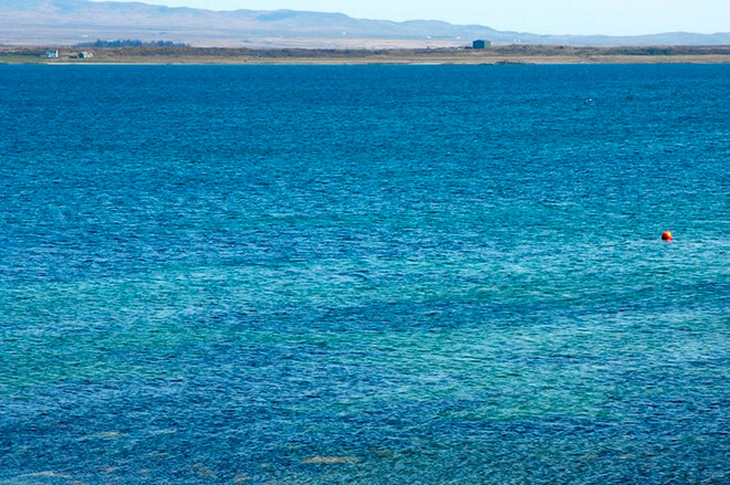
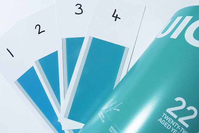
Further to the absence of graphics and photography, favouring modern san-serif typographic solutions—one aspect of the distillery’s branding that allows it to occupy this rare position in the market is it’s bold use of colour. It’s not just colour for colour’s sake, it’s a well thought out method in engaging with customers and communicating an important aspect of where the whisky comes from;

“Our blue/green colour – we call it “aqua” – is quite simply the colour of the sea outside the distillery on a bright spring day – we see it a thousand times a day when we look out of the window, and we have never seen the same colour twice. It really is wonderfully enigmatic and fleeting, and we confess to having spent many tens of thousands of pounds in proofing our tins over the years to try and capture that particular shade of aqua exactly – an evocative representation of that capricious light and sea that is such a feature of these Western Isles.”

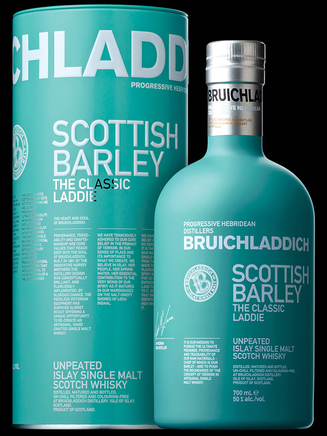
Singling out just one of Bruichladdich’s packaging solutions to comment on—regarding how they’re using progressive design and print techniques to help them stand out—is difficult as they are all impressive, but there is one range that stands out for me. ‘The Classic Laddie’

Bruichladdich_Scottish_Barley_Single_Malt_Scotch_Whisky

The aqua colour has been used as the main feature in this design, giving the bottle some serious shelf presence. A technique very rarely seen in the drinks industry—the bottle itself has been dipped in a lovely matte coating of the distillery’s famous colour, the rich ‘aqua’ paint adhering to the glass to give it a smooth feel in the hand which emotes luxury. Added to this feeling of luxury is the silver foil used to seal in the bottles cork, a nice contrast of materials. The matte finish of the bottle opposes the shelf norm of shiny glass, helping it stand out in the customer’s periphery.

Furthering this distinctive bottle treatment, the well considered typography has been printed in a matte white spot uv, bold but not over-powering. The type provides a different texture providing a nice contrast to the smooth bottle finish.

bruichladdich-10-yo-13

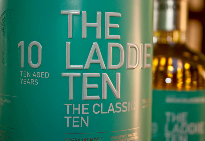
Progressive print techniques have also been utilised on the range’s tins that house the bottles. They’ve embossed the tin to make a feature of the bold typography—which becomes tangible in the customer’s hand, instilling a feeling of luxury and craft. Other nice touches are they clear spot uv logo emblem—hinting at the distillery’s heritage—which catches light at differing angles. Lastly, the silver foil used for some of the body type—again, providing that hint of class and luxury.

In relation to the question of Scottish distilleries being too conservative, for Bruichladdich, the word ‘conservative’ is obviously absent from their vocabulary. Their story and ethos that leads their bold design choices have truly set them apart from the vast majority of whiskies on the market and I, for one, applaud the results.

Have you seen any Whisky packaging you think I should be looking at or any thoughts on the ones featured? Let me hear your thoughts in the comment section below, thanks!


Eamon

Untitled-1

24
Jul

‘The Water of Life’ — Welcome to Jura

The question I posed and will continue to explore in ‘The Water of Life’ is, ‘Are Scottish whisky companies staying too conservative with how they are branding in an already saturated market? In this edition I’m going to be focusing on an example of how one distillery has challenged it’s branding, managing to stay true to it’s origins but explore it at a more progressive angle in order to set them apart…

In this, the latest instalment of my whisky odyssey, I’ll be transporting you to the mystical Isle of Jura. Nestled off the West Coast of Scotland. It’s only 60 miles as the crow flies from Glasgow but takes a wee while to get there. One road, one distillery, one pub, one shop and one community. It’s often been described as remote and even George Orwell went so far as to say it was ‘the most un-get-at-able place’, whilst he was writing 1984.

Home of the Diurachs, Jura is steeped in rich Scot’s culture, myths, and legends, this small island boasts a distillery producing one of the most revered single malts the country has to offer. Taking it’s name from the land in which provides it’s essential ingredients, I give you… Jura.

In 2013, Jura embarked on redesigning it’s packaging and communications in order to better communicate the company’s brand values, to stand out on the shelves, and—more importantly—showcase their whisky’s distinctive flavour profiles. In this edition of ‘The Water of Life,’ I’ll be looking into just how they did it.


jura_refresh_0


There are four classic bottlings in the Jura Collection, each with their own distinctive flavour profiles: the light and delicate Origin 10; the rich and full bodied Diurachs’ Own 16 year old; and Superstition and Prophecy, which are lightly and heavily peated respectively.

To emphasise each bottles flavour profile, Jura’s progressive branding concept attaches a mythological story from the island’s history. In the case of ‘Prophecy’ the story goes…

‘In the early 1700’s the Campbells of Jura evicted a wise old seeress. Bristling with resentment, she prophesied that the last Campbell to leave the island would be one-eyed with his belongings carried in a cart drawn by a lone white horse. In 1938 it came true when Charles Campbell, blind in one eye from the Great War, led his white horse to the old pier for the last time.’

Just like Jura, Prophecy is a dram that’s steeped in stories, and every drop has a different tale to tell.

So, with the blank canvas of a whisky bottle and box—how have Jura managed to communicate these interesting stories through design?

Simple… same as all great design, with close attention and consideration to detail.

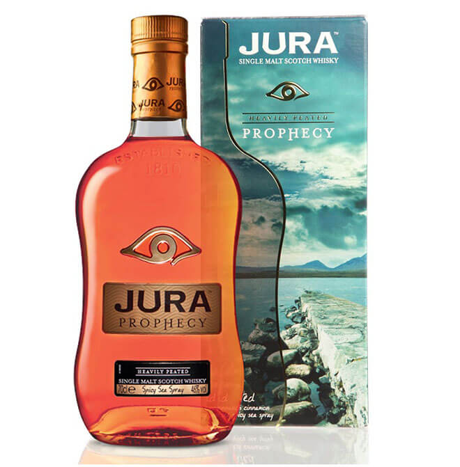
Each carton has its own distinct colour palette featuring a different image, drawn from the landscape of Jura. The image that adorns each carton was art-directed as to connect back to the whisky’s distinct island story and sits beside a half outline of the distinctive Jura bottle shape. When the expressions are lined up together the outlines join up to reveal the whole outline of the iconic Jura bottle. Furthering this concept, each bottle has been attached to a mythical symbol to represent each island legend in just one marque.

For the purpose of the blog and conciseness, I’ll concentrate on Jura’s ‘Prophecy.’


Jura Prophecy-1


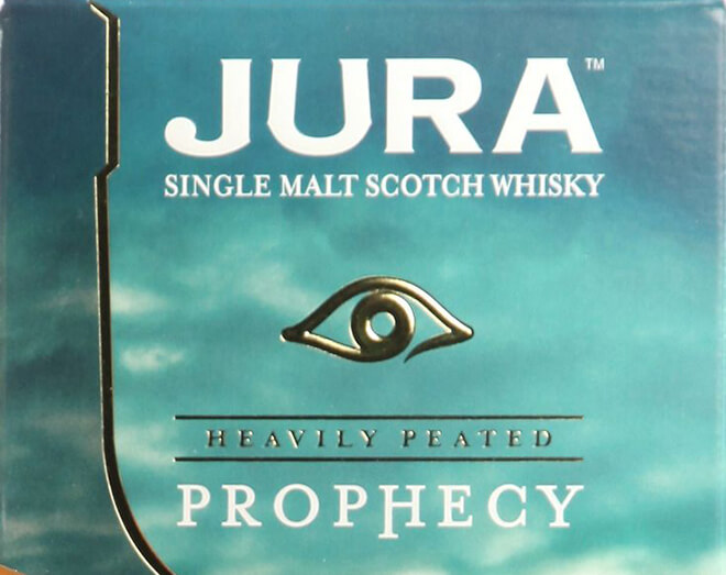
Starting with the photograph used for it’s box, the photo shoot’s art director chose the point on the island’s shore where he thought that the Campbell from the story left from, white horse in hand. This photograph is overlaid with the silhouette of Jura’s distinctive shape and a classic touch of metallic foil to add some luxury to the box.

Moving on to the bottle itself, there are a lot of interesting finishing techniques that have been harnessed to communicate the single malt’s story.


Jura (7)

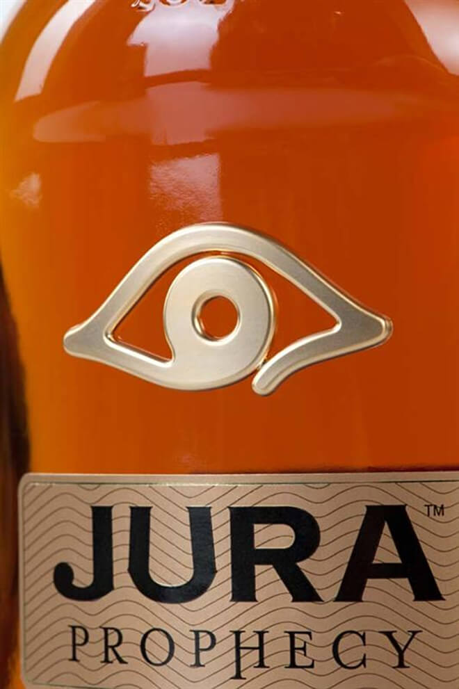
I’ll start with the most important, and my personal favourite aspect. It’s the mythical symbol. The eye has so much power in it and brilliantly prefaces the mythical story. For me, It’s the finish used that propels it in front of all other aspects. The metallic symbol has been cast onto the bottles glass—a very very forward-thinking solution in the realms of whisky packaging—infusing the metal with the glass in the same way that the story and mythology is fused with the history of the island. The raised relief of the symbol makes it tangible and adds a very luxurious feel to the overall bottle.

3D EMBOSS

This look is carried on to the bottles box, with the symbol being three-dimensionally embossed on the card. No small feat in consideration to production, the emboss is created using a heated roll-press which the box passes through a male/female die, the heat and pressure work in unison to create the depth of relief. Details of this mysticism are also brought into the tone of voice of the copywriting present on the box.

Coupled with the bottle’s understated glass embossing, hot foiling (see last blog), and metallic labelling, all aspects come together to successfully communicate Jura’s story.

As I think you’ll agree, all these design factors combine to allow Jura whisky to inhabit the more progressive and recognisable end of the spectrum when it comes to the overwhelming selection of Scottish whisky designs on our shelves.

Stay tuned to this blog in the coming weeks where I’ll be looking deeper into the whisky industry and showcasing brands using design and print finishes in interesting ways to set their fine malts apart from the rest.


Eamon

Untitled-1

22
Jul

‘The Water of Life’ – a deeper look into whisky.

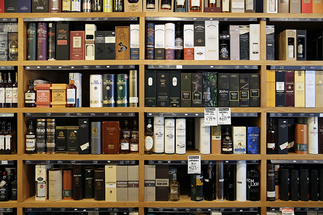
Picture the scene — you’re standing in a whisky shop, tasked with selecting a fine malt to enjoy with friends over the weekend, their enjoyment rests on your shoulders. What to choose? The vast walls of options are dizzying and your knowledge of whisky is left wanting.

nicks-selection

So, what one do you choose?

Stripped back to the core element, the alcoholic yellowy-brown liquid is merely a concoction of fermented grains, distilled and aged in some sort of wooden cask. But — and it’s a big BUT — whisky is so much more than just that. It’s about how the company has crafted their blend, heritage and most importantly, their story.

Your choice? Still undecided?

It’s at this moment where Whisky companies are at battle for your attention — and the weapon of choice for the battle is, great design.

The designs for whisky labels/bottles/packaging are crafted to communicate the companies story and what the customer can hope to experience with that company’s specific mix.
So, how do they do that?

It all starts with extensive research, this is where the hard work is put in by designers in order to successfully communicate, exactly, the whisky’s character and narrative. Here I’ll feature a few companies who I feel have hit the mark with how they’ve handled the task, and comment on what techniques they’ve used in order to successfully communicate their message.

What I wonder, and what i’ll challenge in this blog, is… are Scottish whisky companies staying too conservative with how they are branding in an already saturated market? Over the weeks I’ll feature examples of how interesting design and print finishes can set a Scottish whisky apart from it’s competitors.

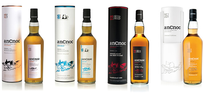
I’ll be starting with a feature on the fine examples created by the Knockdhu distillery in Knock, Aberdeenshire. AnCnoc is the distillery’s range of aged single malts, each boasting an eye-catching and progressive bottle and canister design.

anCnoc whisky

It is the range’s minimal packaging style that sets them apart from the crowd. Whilst browsing shelves upon shelves of whiskies with conservatively styled labelling, this style certainly catches the eye.

So, what makes these designs successful?

Out with the lovely treatment of type and the subtle use of colour, for me, it boils down to three important aspects; the choice of material used, the subtle illustration, and the print finish.

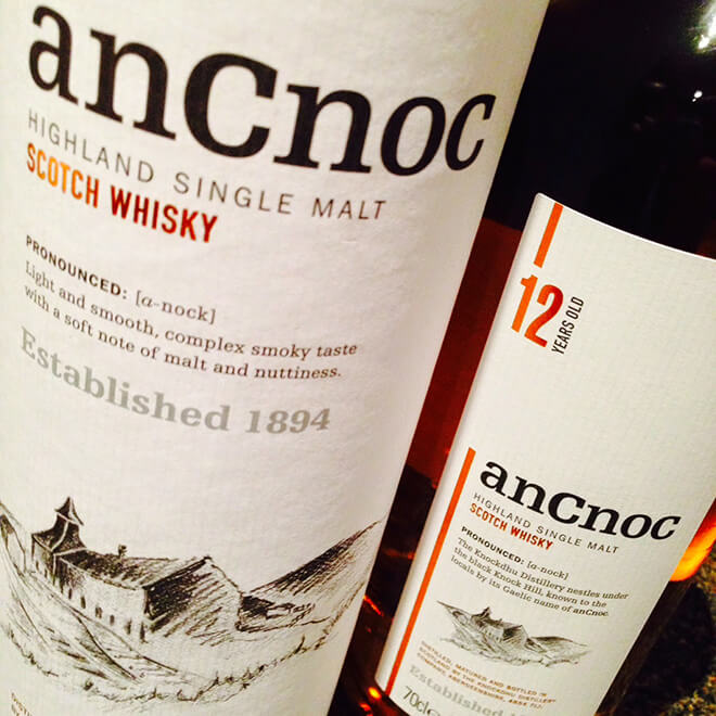
Starting with the choice of material — the paper stock chosen for both the canister and the bottle labelling, has been carefully considered so that it communicates quality. Getting hands-on with the packing is the customer’s first physical interaction with the product and an instant feeling of quality is generated whilst running your hand across the premium texture of the paper. You can see the subtle texture of the paper in this close-up image…

photo 2
Secondly, the lovely illustration of the Knockdhu’s grassroots distillery, present across the full range, works well in subtly communicating where the whisky is coming from. It gives a sense of the whisky’s Scottish heritage but in a completely non-intrusive manner.

Thirdly, and most important in the purpose of this blog, is the the print finishes used on anCnoc’s packaging. A hot trend in whisky packaging at the moment is foil-blocking, a method in which a heated printing press adheres a metallic finish to the paper. This finish gives an instant touch of class to the packaging, communicating the brand’s consideration of quality. AnCnoc employs the foil-block finish in a very understated fashion, using it to effectively highlight the most important parts on the label. Furthering the feeling of quality generated by this print finish, the die which adheres the foil also leaves a letterpress style finish, leaving the elements of foil slightly embossed, creating tangibility in the illustration and typography.

anCnoc hot foil

As I think you’ll agree, all these design factors combine to allow anCnoc whisky to inhabit the more progressive and recognisable end of the spectrum when it comes to the overwhelming selection of Scottish whisky designs on our shelves.

Stay tuned to this blog in the coming weeks where I’ll be looking deeper into the whisky industry and showcasing brands using design and print finishes in interesting ways to set their fine malts apart from the rest.


Eamon

Untitled-1