‘Soulman!!’
That was the name we gave the incredibly talented Marek Brol.
As January draws towards a close, we are using the rest of the month to celebrate the creative achievements of our team. Marek Brol joined us in March of 2017 and it’s to safe to say that we were bowled over by his desire, creativity, and intensity. Marek did many wonderful things for the loft before sadly departing back to his homeland towards the end of the year. Although Marek’s no longer with us in the studio, the memory of a wonderful person, lots of great times, and some staggeringly beautiful work remain with us. Acts of creativity that we are truly grateful for. We can’t wait to see what Marek does next, but in the meantime, these are his highlights of 2017:
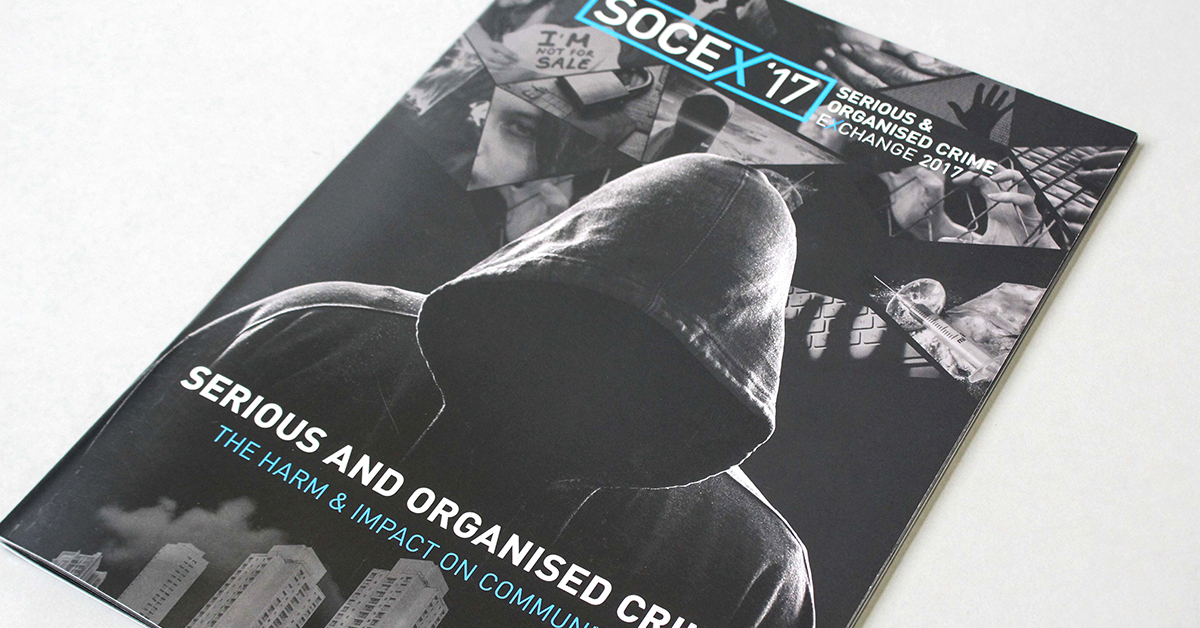
1. SOCEX 2017
The first thing Marek did for us at the loft was the beautiful SOCEX 2017 brochure. A person who loves the symbolic and meaningful, Marek got his teeth into the project with a drive which immediately impressed us. He thoughtfully and intelligently built on the SOCEX visual framework which had been established with previous publications but he breathed new life into it with a serious of super-dramatic backdrop images on various pages, eye-catching colour scheme, and an impactful front cover. The cover shows a menacing hooded figure against a backdrop of several of the conference themes constructed as a mosaic. Instant Impact! Marek, as with all our projects, was ably supported by the team, but this one really does have his personality all over it.
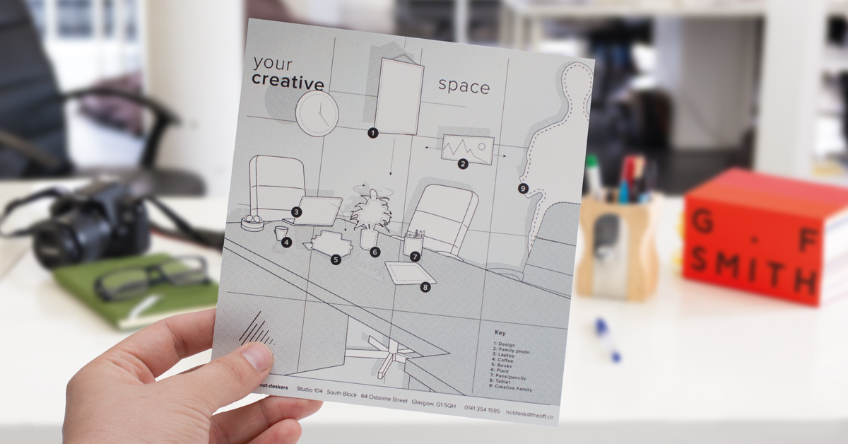
2. YOUR CREATIVE SPACE
One of Marek’s greatest talents was his ability to use bold creative ideas to bring just about any subject to life. The loft last year was offering hot-desk spaces in its large South Block studio and one of the greatest challenges was the presentation of a space which would be originally sparse and empty until used. Marek, along with his colleagues, beautifully used the idea of putting props such as your ‘laptop, photo, and creative family’ into a beautiful descriptive drawing, complete with annotations, which truly brings the scene to life while selling that all important element of ‘individuality,’ so important to creatives. The campaign was a huge success, with enquiries being received to this day, we believe, due in no small part to Marek’s wonderful illustration skills.
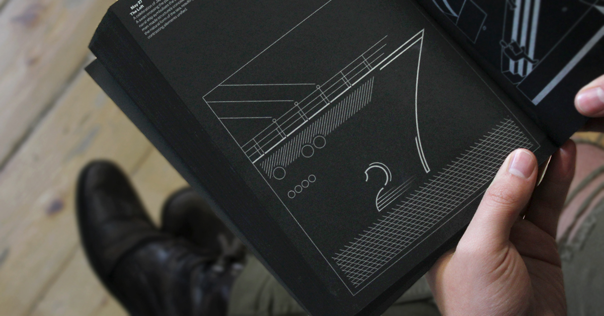
3. Fedrigoni 365
Fedrigoni is one of the world’s most celebrated, famous, and successful paper manufacturers. Designers from all over the world aspire to use Fedrigoni in the projects they work on. In 2017, they had the idea to create a book which celebrates some of the UK’s most prominent designers and design studios, giving each of them a date of the year to creatively represent. Safe-to-say, we were absolutely thrilled and honoured to be given the opportunity. The 27th of May was the date they chose for us. The only condition of the brief was that we had to use black paper, silver ink, and the number had to look like the date being represented. As always, we wanted to give the illustration some meaning and found that the 27th of May is a celebration of ‘Japanese Navy Forces Day.’ The full team put forth ideas and Marek eventually took it on, beautifully illustrating a ship with the hull creating the number ‘7’ and the number ‘2’ being represented as a swan. As it says in the book, “A coincidence of the natural form of the sea, resulting in two contrasting elements unified.” We’re all delighted with the final result.
4. Arcman Sub-Brands
Real design sensitivity is one of the hardest things to achieve as a designer; the understanding of those nuanced details which can make all the difference when creating things. Marek has a rare sensitivity which belies his younger years and this was never shown to greater extent than with his creation of the Arcman sub-brands. He created a full range of icons for Arcman, bringing each of their services to life — welding, fabrication, installation, etc… Each of the different icons show the person doing their craft, but where these particular figures shine is in the dynamism of the poses, the drama of the light-shade, and the careful interpretation of the details such as the sparks of the welder. Real design sensitivity indeed. This wonderful concept image where the welder is working on the letter ‘A’ is beautiful, memorable, and truly eye-catching. An image, which eventually spawned a full series, was used endlessly with different communications by the brand as the year came towards a close and most importantly something that was loved by everybody.
A fitting end to a wonderful year — we wish Marek the very best of luck and can’t wait to see what he does in 2018.


