The question I posed and will continue to explore in ‘The Water of Life’ is, ‘Are Scottish whisky companies staying too conservative with how they are branding in an already saturated market? In this edition I’m going to be focusing on an example of how one distillery has challenged it’s branding, managing to stay true to it’s origins but explore it at a more progressive angle in order to set them apart…
In this, the latest instalment of my whisky odyssey, I’ll be transporting you to the mystical Isle of Jura. Nestled off the West Coast of Scotland. It’s only 60 miles as the crow flies from Glasgow but takes a wee while to get there. One road, one distillery, one pub, one shop and one community. It’s often been described as remote and even George Orwell went so far as to say it was ‘the most un-get-at-able place’, whilst he was writing 1984.
Home of the Diurachs, Jura is steeped in rich Scot’s culture, myths, and legends, this small island boasts a distillery producing one of the most revered single malts the country has to offer. Taking it’s name from the land in which provides it’s essential ingredients, I give you… Jura.
In 2013, Jura embarked on redesigning it’s packaging and communications in order to better communicate the company’s brand values, to stand out on the shelves, and—more importantly—showcase their whisky’s distinctive flavour profiles. In this edition of ‘The Water of Life,’ I’ll be looking into just how they did it.
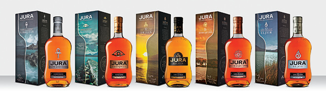
There are four classic bottlings in the Jura Collection, each with their own distinctive flavour profiles: the light and delicate Origin 10; the rich and full bodied Diurachs’ Own 16 year old; and Superstition and Prophecy, which are lightly and heavily peated respectively.
To emphasise each bottles flavour profile, Jura’s progressive branding concept attaches a mythological story from the island’s history. In the case of ‘Prophecy’ the story goes…
‘In the early 1700’s the Campbells of Jura evicted a wise old seeress. Bristling with resentment, she prophesied that the last Campbell to leave the island would be one-eyed with his belongings carried in a cart drawn by a lone white horse. In 1938 it came true when Charles Campbell, blind in one eye from the Great War, led his white horse to the old pier for the last time.’
Just like Jura, Prophecy is a dram that’s steeped in stories, and every drop has a different tale to tell.
So, with the blank canvas of a whisky bottle and box—how have Jura managed to communicate these interesting stories through design?
Simple… same as all great design, with close attention and consideration to detail.
Each carton has its own distinct colour palette featuring a different image, drawn from the landscape of Jura. The image that adorns each carton was art-directed as to connect back to the whisky’s distinct island story and sits beside a half outline of the distinctive Jura bottle shape. When the expressions are lined up together the outlines join up to reveal the whole outline of the iconic Jura bottle. Furthering this concept, each bottle has been attached to a mythical symbol to represent each island legend in just one marque.
For the purpose of the blog and conciseness, I’ll concentrate on Jura’s ‘Prophecy.’
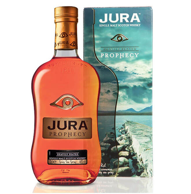
Starting with the photograph used for it’s box, the photo shoot’s art director chose the point on the island’s shore where he thought that the Campbell from the story left from, white horse in hand. This photograph is overlaid with the silhouette of Jura’s distinctive shape and a classic touch of metallic foil to add some luxury to the box.
Moving on to the bottle itself, there are a lot of interesting finishing techniques that have been harnessed to communicate the single malt’s story.
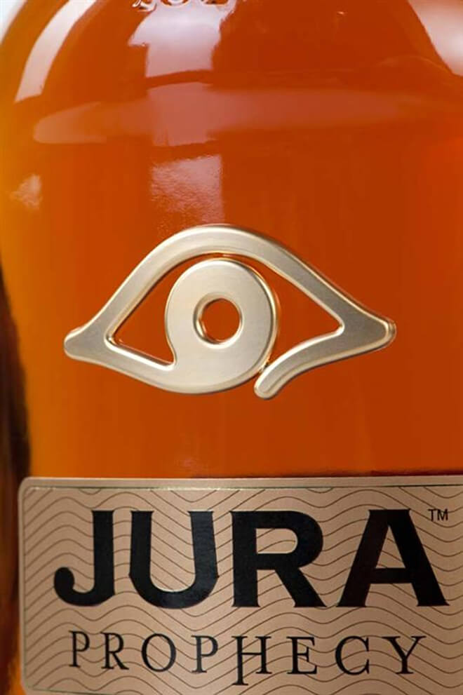
I’ll start with the most important, and my personal favourite aspect. It’s the mythical symbol. The eye has so much power in it and brilliantly prefaces the mythical story. For me, It’s the finish used that propels it in front of all other aspects. The metallic symbol has been cast onto the bottles glass—a very very forward-thinking solution in the realms of whisky packaging—infusing the metal with the glass in the same way that the story and mythology is fused with the history of the island. The raised relief of the symbol makes it tangible and adds a very luxurious feel to the overall bottle.
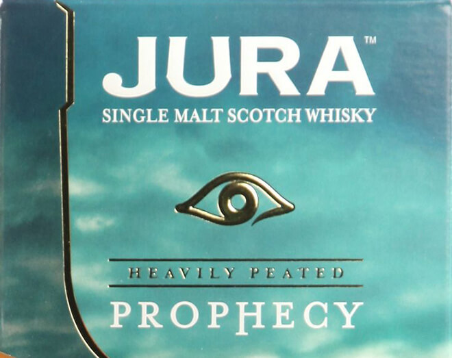
This look is carried on to the bottles box, with the symbol being three-dimensionally embossed on the card. No small feat in consideration to production, the emboss is created using a heated roll-press which the box passes through a male/female die, the heat and pressure work in unison to create the depth of relief. Details of this mysticism are also brought into the tone of voice of the copywriting present on the box.
Coupled with the bottle’s understated glass embossing, hot foiling (see last blog), and metallic labelling, all aspects come together to successfully communicate Jura’s story.
As I think you’ll agree, all these design factors combine to allow Jura whisky to inhabit the more progressive and recognisable end of the spectrum when it comes to the overwhelming selection of Scottish whisky designs on our shelves.
Stay tuned to this blog in the coming weeks where I’ll be looking deeper into the whisky industry and showcasing brands using design and print finishes in interesting ways to set their fine malts apart from the rest.
Eamon
Comments ( 0 )