Tag: Graphic Designer

24
Jan

Marek Brol | Design Highlights 2017

‘Soulman!!’

That was the name we gave the incredibly talented Marek Brol.

As January draws towards a close, we are using the rest of the month to celebrate the creative achievements of our team. Marek Brol joined us in March of 2017 and it’s to safe to say that we were bowled over by his desire, creativity, and intensity. Marek did many wonderful things for the loft before sadly departing back to his homeland towards the end of the year. Although Marek’s no longer with us in the studio, the memory of a wonderful person, lots of great times, and some staggeringly beautiful work remain with us. Acts of creativity that we are truly grateful for. We can’t wait to see what Marek does next, but in the meantime, these are his highlights of 2017:
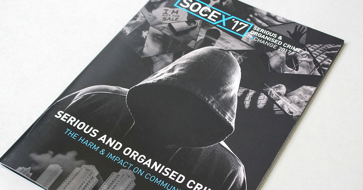
SOCEX 2017 Brochure

1. SOCEX 2017

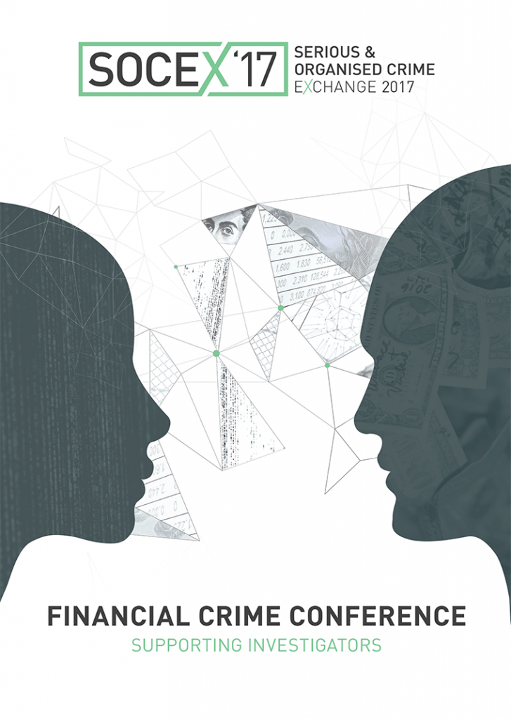
The first thing Marek did for us at the loft was the beautiful SOCEX 2017 brochure. A person who loves the symbolic and meaningful, Marek got his teeth into the project with a drive which immediately impressed us. He thoughtfully and intelligently built on the SOCEX visual framework which had been established with previous publications but he breathed new life into it with a serious of super-dramatic backdrop images on various pages, eye-catching colour scheme, and an impactful front cover. The cover shows a menacing hooded figure against a backdrop of several of the conference themes constructed as a mosaic. Instant Impact! Marek, as with all our projects, was ably supported by the team, but this one really does have his personality all over it.

Hot Desk Campaign

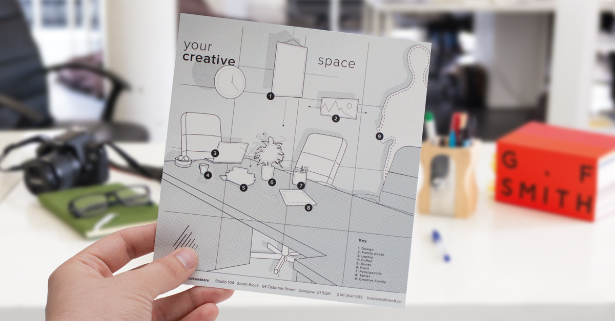
2. YOUR CREATIVE SPACE

One of Marek’s greatest talents was his ability to use bold creative ideas to bring just about any subject to life. The loft last year was offering hot-desk spaces in its large South Block studio and one of the greatest challenges was the presentation of a space which would be originally sparse and empty until used. Marek, along with his colleagues, beautifully used the idea of putting props such as your ‘laptop, photo, and creative family’ into a beautiful descriptive drawing, complete with annotations, which truly brings the scene to life while selling that all important element of ‘individuality,’ so important to creatives. The campaign was a huge success, with enquiries being received to this day, we believe, due in no small part to Marek’s wonderful illustration skills.
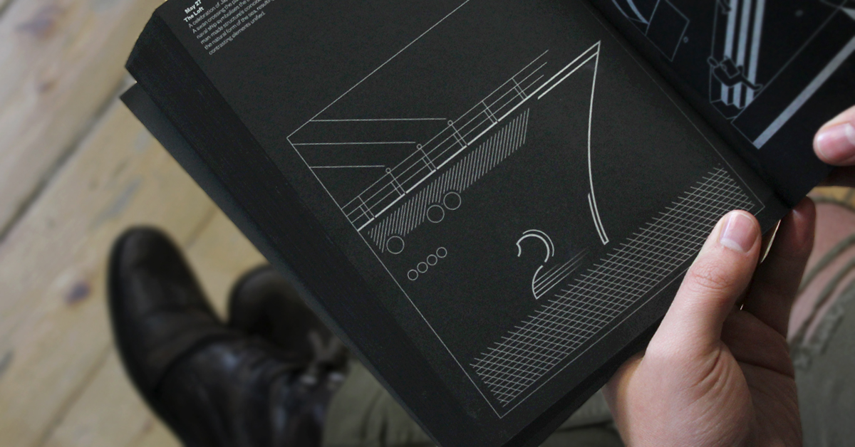
Fedrigoni 365

3. Fedrigoni 365

Fedrigoni is one of the world’s most celebrated, famous, and successful paper manufacturers. Designers from all over the world aspire to use Fedrigoni in the projects they work on. In 2017, they had the idea to create a book which celebrates some of the UK’s most prominent designers and design studios, giving each of them a date of the year to creatively represent. Safe-to-say, we were absolutely thrilled and honoured to be given the opportunity. The 27th of May was the date they chose for us. The only condition of the brief was that we had to use black paper, silver ink, and the number had to look like the date being represented. As always, we wanted to give the illustration some meaning and found that the 27th of May is a celebration of ‘Japanese Navy Forces Day.’ The full team put forth ideas and Marek eventually took it on, beautifully illustrating a ship with the hull creating the number ‘7’ and the number ‘2’ being represented as a swan. As it says in the book, “A coincidence of the natural form of the sea, resulting in two contrasting elements unified.” We’re all delighted with the final result.

Arcman Billboard

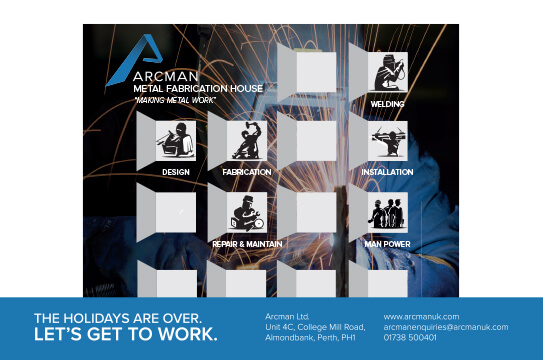
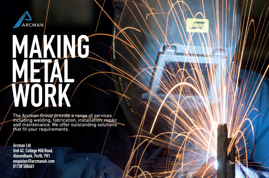
4. Arcman Sub-Brands

Real design sensitivity is one of the hardest things to achieve as a designer; the understanding of those nuanced details which can make all the difference when creating things. Marek has a rare sensitivity which belies his younger years and this was never shown to greater extent than with his creation of the Arcman sub-brands. He created a full range of icons for Arcman, bringing each of their services to life — welding, fabrication, installation, etc… Each of the different icons show the person doing their craft, but where these particular figures shine is in the dynamism of the poses, the drama of the light-shade, and the careful interpretation of the details such as the sparks of the welder. Real design sensitivity indeed. This wonderful concept image where the welder is working on the letter ‘A’ is beautiful, memorable, and truly eye-catching. An image, which eventually spawned a full series, was used endlessly with different communications by the brand as the year came towards a close and most importantly something that was loved by everybody.

A fitting end to a wonderful year — we wish Marek the very best of luck and can’t wait to see what he does in 2018.

08
Jan

Reiss McLeod | Design Highlights 2017

2017 was a big year for Reiss. After a summer internship and a year of working part-time, Reiss became a full-time member of the loft team once he finished his studies in July. Anybody that knows Reiss knows he is an incredibly talented guy with exceptional basic skills, an uncanny ability to generate ideas out of no-where and he’s a great wordsmith too. His puns are quite the thing of legend in the studio.

As expected Reiss eased into his new role and quickly became a pivotal part of the team adding the role of ‘Director of Client Happiness’ to his design responsibilities. Already an exceptional creative-thinker and problem solver, he added some real weight to his development skills throughout the year culminating in several exceptional pieces of creative work which we’d love to celebrate.

Although we always work as a team at the loft, we wanted to take a moment to value individual contributions to creative projects and Reiss really delivered tremendously in 2017, these were some of his highlights.

CashBack_HD-PNG

1. Cashback Infographic for Inspiring Scotland

Quite possibly the highlight of the year for Reiss was his interpretation of the positive information for ‘Cashback for Communities’ for Inspiring Scotland. The programme involves taking the proceeds of crime and re-investing it back into local communities for young people — £20,000,000 has been re-invested into improving life opportunities since 2014. The programme is led by the Scottish Government alongside Inspiring Scotland and Reiss took an incredibly large amount of information and alongside his cohort Laura developed a beautiful illustration-infographic hybrid depicting a wonderful tale of the programme. The interpretation of the individual mini-stories where Cashback has made a difference in the community is a real highlight. The infographic has been such a success that it adorns the walls of the offices at Inspiring Scotland as well as The Scottish Government.

SOCEX - Financial Crime Conference

2. SOCEX Financial Crime Conference Brochure

The loft has worked with the event organisers for The Serious & Organised Crime Exchange (SOCEX) since 2015 and have since created a number of set-piece conference brochures. Reiss took the lead with the latest instalment — The 2017 Financial Crime Conference in November. Reiss built on the visual frameworks of previous brochures but where his creativity really shone through is with the imaginative, purposeful and almost iconic design of the front cover which cleverly shows two people exchanging ideas – ideas that are all emblematic of themes being dealt with by the conference. A beautiful, abstract and fitting depiction for the newly formed financial conference. We can’t wait for the 2018 events…

Arcman-Making Christmas Campaign

3. Arcman Winter Campaign Image

Our Reiss is an accomplished wordsmith and real creative thinker. Never was this more beautifully brought to life than with his campaign image and advert for the winter edition of print magazine ‘Urban Realm.’  Building on the Christmas theme – Reiss cleverly realised that the ad created for Arcman was going to be seen just as much in January as December so beautifully saw past the obvious Christmas theme and instead brought the sentiment of ‘getting back to wor’k to life. A Christmas calendar with the various services of Arcman as windows remain in place but are all secondary to those strong words ‘The Holidays are over. Let’s Get To Work.”  In-keeping with the company values and a real success.

Client Top 5 FAQs

4. Introducing ‘the pigs’

Reiss has an absolutely wonderful imagination and a real ability to creatively communicate information. Part of his role as ‘Director of Client Happiness’ is to share best-practices with others in the team. His creative ability was on full-display when he introduced a series of odd-looking creatures to us as his way to demonstrate his ideas for ‘Client Happiness.’ These little creatures which we affectionately christened ‘the pigs’ have since found their way into many parts of the loft’s brand presentation in 2017.

Arcman-Making Metal Work

5. ‘MAKING METAL WORK’ for Arcman

Once again Arcman were looking for a series of print ads for the Urban Realm annual, something which would demonstrate the high-energy nature of their service, commitment to clients and desire for excellence. Reiss came up with a rather simple concept but one which really shone. He mixed the excellent photography of Malcolm Cochrane with an exceptionally well-selected typeface to bring the vibrancy of the Arcman message to life for print, digital and everything in between… The campaign advert was so widely liked by the company founder Jamie Doak that it proudly adorns his I-Phone and is mounted on the front of the Arcman workshops.

Reiss was a huge part of the loft’s success in 2017 and we can’t wait to see what ideas, graphics and even puns he has up his sleeve for 2018.