THE BLOG

31
Jan

Malcolm Cochrane | Design Highlights 2017

All this month we’ve been taking a look back and celebrating the wonderful achievements of our creative team in 2017. We kicked the month off in fine style with some of the excellent works of our Reiss, we then featured Laura, followed by Marek. As the month draws to a close, we’d like to end our series by acknowledging and celebrating the achievements of Malcolm Cochrane — a photographer that we have worked with many, many times over the years.

Whether he was working on factory shots, intimate portrait images, or something a little more creative, Malcolm was always able to deliver photographs that told a story, had an enduring quality, and a sensitivity which regularly delighted. Pretty much another member of our creative team, we all loved working with Malcolm in 2017 and we can’t wait to work further with him in 2018.

These are Malcolm Cochrane’s highlights with the loft in 2017…

SLG_Twitter_Blog

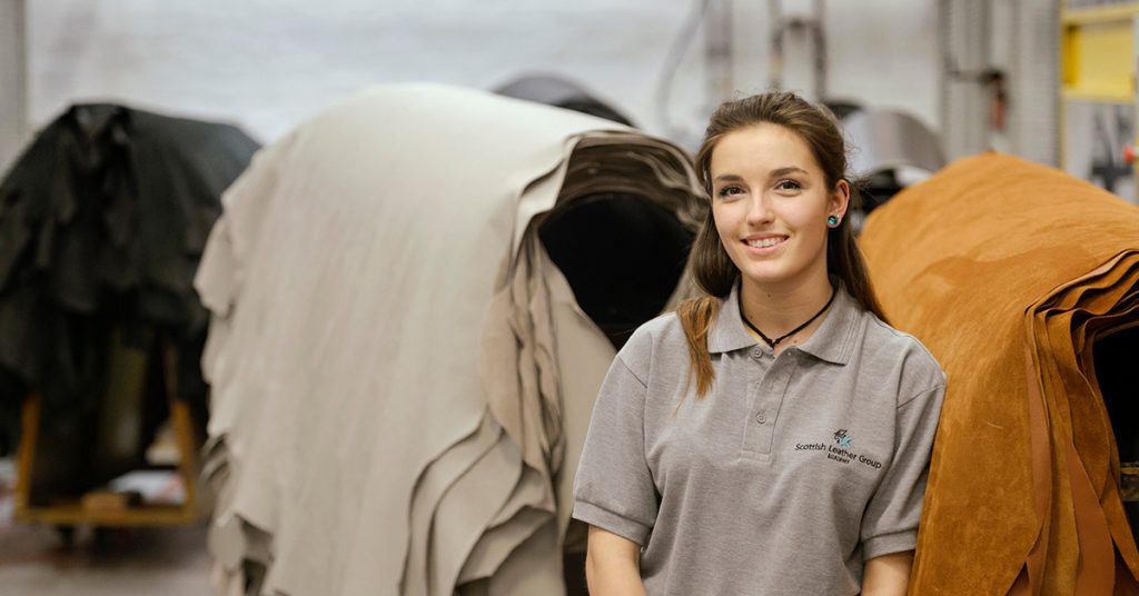
Iona of Bridge of Weir

One of Malcolm’s greatest strengths is his ability to capture people and one of the best examples of this was with his capturing of Iona from Bridge Of Weir Leather. Iona is one of 10 leather production and manufacturing apprentices undertaking a 2-year course with Scottish Leather Group. As part of her apprenticeship, Iona will undertake many different roles within the factory. This effortless shot by Malcolm excellent captures Iona in front of the leather she has dedicated her career to learning about.

Tradeprint_Twitter_Blog

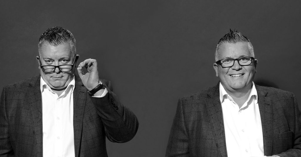
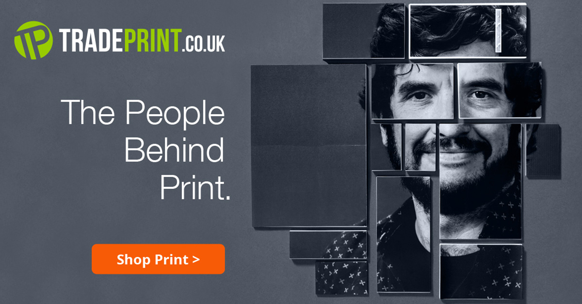
Anthony of Tradeprint

Tradeprint are one of the largest print suppliers in the country providing an unparalleled level of quality and service. ‘The People Behind the Print’ was the campaign we co-created with them, highlighting the magnificent people in their team. People that really add value to the client relationships, the process, and what they are looking to achieve.

Malcolm beautifully captured the entire team with a range of poses showing off the different sides of their characters. Subtle lighting, bold compositions, and a real variety of expressions truly brought these magnificent photographs to life. They became the focal point of a wonderful campaign.

Loft_Twitter_Blog

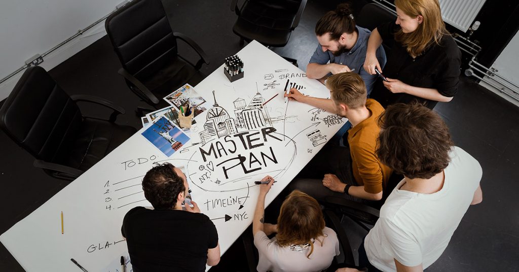
THE LOFT ‘Master Plan’

The loft have worked with Malcolm on many, many shoots and we have been privileged to have him photograph us many times. In the summer of 2017, Malcolm did this lovely little overhead shot of the loft team drawing out their master-plan for the future. A fun shot where he beautifully captures the energy of a dramatic scene from a wonderfully interesting angle. Another great image from what is an ever-growing collection.

YES_Twitter_Blog

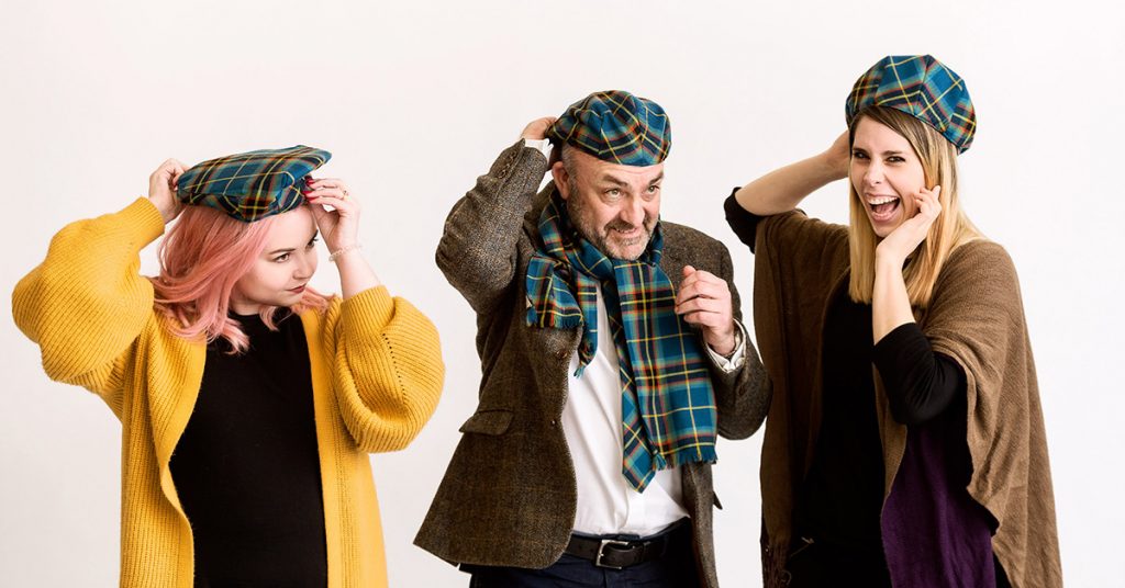
‘Tartan Hats’ with YOUNG ENTERPRISE SCOTLAND

One of the great things about working with Malcolm is some of the brilliant off-camera moments he captures. A recent shoot with the great folk from Young Enterprise Scotland is about to spawn some brilliant new professional photos which are going to be used for a new publication. In between the serious stuff, Malcolm caught this fun image of Lucy, Geoff, and Christiana from Young Enterprise Scotland trying on their hats — complete with the YES tartan colours.

This concludes Malcolm’s design highlights with the loft in 2017 and the end of the series. We’ve loved every minute of reliving these highlights and are massively, massively grateful for the entire contribution made by everybody in 2017.

We look forward to seeing what everybody does in 2018.

24
Jan

Marek Brol | Design Highlights 2017

‘Soulman!!’

That was the name we gave the incredibly talented Marek Brol.

As January draws towards a close, we are using the rest of the month to celebrate the creative achievements of our team. Marek Brol joined us in March of 2017 and it’s to safe to say that we were bowled over by his desire, creativity, and intensity. Marek did many wonderful things for the loft before sadly departing back to his homeland towards the end of the year. Although Marek’s no longer with us in the studio, the memory of a wonderful person, lots of great times, and some staggeringly beautiful work remain with us. Acts of creativity that we are truly grateful for. We can’t wait to see what Marek does next, but in the meantime, these are his highlights of 2017:

SOCEX 2017 Brochure

1. SOCEX 2017

The first thing Marek did for us at the loft was the beautiful SOCEX 2017 brochure. A person who loves the symbolic and meaningful, Marek got his teeth into the project with a drive which immediately impressed us. He thoughtfully and intelligently built on the SOCEX visual framework which had been established with previous publications but he breathed new life into it with a serious of super-dramatic backdrop images on various pages, eye-catching colour scheme, and an impactful front cover. The cover shows a menacing hooded figure against a backdrop of several of the conference themes constructed as a mosaic. Instant Impact! Marek, as with all our projects, was ably supported by the team, but this one really does have his personality all over it.

Hot Desk Campaign

2. YOUR CREATIVE SPACE

One of Marek’s greatest talents was his ability to use bold creative ideas to bring just about any subject to life. The loft last year was offering hot-desk spaces in its large South Block studio and one of the greatest challenges was the presentation of a space which would be originally sparse and empty until used. Marek, along with his colleagues, beautifully used the idea of putting props such as your ‘laptop, photo, and creative family’ into a beautiful descriptive drawing, complete with annotations, which truly brings the scene to life while selling that all important element of ‘individuality,’ so important to creatives. The campaign was a huge success, with enquiries being received to this day, we believe, due in no small part to Marek’s wonderful illustration skills.

Fedrigoni 365

3. Fedrigoni 365

Fedrigoni is one of the world’s most celebrated, famous, and successful paper manufacturers. Designers from all over the world aspire to use Fedrigoni in the projects they work on. In 2017, they had the idea to create a book which celebrates some of the UK’s most prominent designers and design studios, giving each of them a date of the year to creatively represent. Safe-to-say, we were absolutely thrilled and honoured to be given the opportunity. The 27th of May was the date they chose for us. The only condition of the brief was that we had to use black paper, silver ink, and the number had to look like the date being represented. As always, we wanted to give the illustration some meaning and found that the 27th of May is a celebration of ‘Japanese Navy Forces Day.’ The full team put forth ideas and Marek eventually took it on, beautifully illustrating a ship with the hull creating the number ‘7’ and the number ‘2’ being represented as a swan. As it says in the book, “A coincidence of the natural form of the sea, resulting in two contrasting elements unified.” We’re all delighted with the final result.

Arcman Billboard

4. Arcman Sub-Brands

Real design sensitivity is one of the hardest things to achieve as a designer; the understanding of those nuanced details which can make all the difference when creating things. Marek has a rare sensitivity which belies his younger years and this was never shown to greater extent than with his creation of the Arcman sub-brands. He created a full range of icons for Arcman, bringing each of their services to life — welding, fabrication, installation, etc… Each of the different icons show the person doing their craft, but where these particular figures shine is in the dynamism of the poses, the drama of the light-shade, and the careful interpretation of the details such as the sparks of the welder. Real design sensitivity indeed. This wonderful concept image where the welder is working on the letter ‘A’ is beautiful, memorable, and truly eye-catching. An image, which eventually spawned a full series, was used endlessly with different communications by the brand as the year came towards a close and most importantly something that was loved by everybody.

A fitting end to a wonderful year — we wish Marek the very best of luck and can’t wait to see what he does in 2018.

16
Jan

Laura Campbell | Design Highlights 2017

Last week we were delighted to kick off our series in celebrating the achievements of our creative team in 2017. We started with Reiss McLeod and this week we are delighted to be taking a look back at the exceptional work of his ‘partner-in-crime’ Laura Campbell.

Laura Campbell, a graduate of ‘Gray’s School of Art’ in Aberdeen, joined our team in March 2017 and what an incredible year she has had. Laura quickly became a go-too person for creative ideas, managing the ever-intricate print process and finally adding some much-needed video to the loft’s social media presence. Such was her deftness with social media that the young lady, we once thought was quiet, became our ‘Director of Noise.’ A role she has led with absolute distinction since.

Laura is multi-talented – a person who is comfortable at all stages of the design process, a keen developer/illustrator and somebody who the clients often rave about, she is one of the most trusted members of our team and is also great fun to be around too.

These are Laura Campbell’ highlights of 2017.

Tradeprint

1. Tradeprint ‘People Behind The Print’

One of Laura’s biggest successes of 2017 was her fantastic work on the ‘People Behind Print’ campaign for Tradeprint. Tradeprint is one of the country’s largest providers of online print where their team helps large companies, organisations and agencies with their printing requirements. They have incredible geographical reach, an extremely wide variety of products and most importantly their print coaches – Laura very skilfully acknowledged the value of the ‘print coaches’ in a commoditised market flooded with competition.

She built on this by creating a range of beautiful concepts with the print coaches being at the heart of the campaign, they were captured with simple portraits, expressive poses and then some beautifully creative mixed-media collages using Tradeprints own stock. The concepts were all Laura’s while working with Tradeprint brand Director James Barrett Bunnage and photographer Malcolm Cochrane on a range of materials spanning print advertisements, social media posts and beautiful landing page micro-sites. One for each of the print coaches. Top work indeed…

VRU Scotland

2. VRU Scotland ‘Street & Arrow’ Display Stand

Laura, with her cohort Reiss, played a pivotal part in the development of this unique and very special display-stand created for VRU Scotland’s ‘Street & Arrow.’ ‘Street & Arrow’ is a programme led by The Violence Reduction Unit to help people make the transition from leading lives of crime back into employment. As part of a wider creative project and the opportunity to do something different for a trade show, Laura captured the chance to bring this incredibly interesting piece of work to life. Created in record-quick time, you will see the transition of the individual from criminal to worker in the artwork, the spray-painting of the characters carefully produced on actual chipboard and Reiss and Laura celebrating a remarkable day’s work. All carried out from the warehouse of a good friend. Not your typical trade-show stand. Not your typical day at the studio but a wonderful result.

Scottish Leather Group

3. Scottish Leather Group Sustainability Report 2017

This was the second Sustainability Report we created for Scottish Leather Group after a successful 2016. The team were asked to take the concept of sustainability forward and Laura duly obliged. Her concept of ‘using less ink’ with the text, graphics and mainly the images of the brochure was seen as very fitting for a document celebrating some remarkable achievements by the company regarding its sustainability. The image of leather off-cuts on the brochure shows this concept to beautiful effect – once again with the exceptional photography of Malcolm Cochrane.

Geckotech Calendar

4. Geckotech Calendar

One of Laura’s biggest achievements of 2017 was the design of the 2018 Geckotech Calendar. Geckotech Solutions are a company which supplies clients with access engineering solutions including industrial rope access, confined space entry and the installation of temporary working platforms. She worked closely with Nancy Pearson from Geckotech Solutions and Ruth McFarlane of Exactaprint where she selected the most eye-catching images available, sensitively developed them with a ‘Black & White’ theme with very dramatic orange accents and once again managed a very intricate print process. The final calendars were wonderfully received by the client, their clients and all involved. Yet another exceptional outcome for our Laura.

Research Scotland Infographics

5. Research Scotland Report on the 14:19 Fund

Infographics have been round a long-time, starting with everything from the pie and bar charts used in office packages on original PCs, they became more widely popular in recent years to tell longer, more complicated and intricate stories in an easier, friendlier and more digestible way. They are seen everywhere today from business plans to product instructions to the communication of complicated financial information. At the loft we have been very much at the heart of the development of the infographic and how they are evolving, particularly with motion graphics. Laura took the original infographic concept and gave it a new lease of life with the combination of high-impact visual photography to create images of tremendous effect. The infographics Laura created for Research Scotland’s reporting of ‘Inspiring Scotland’s 14:19 Fund’ are some of the freshest and most exciting that we’ve seen and been involved in a long time.

It’s safe to say that it’s been an absolutely incredible year for Laura and we could easily have created another week’s worth of materials.

Looking forward to seeing what she creates in 2018!

08
Jan

Reiss McLeod | Design Highlights 2017

2017 was a big year for Reiss. After a summer internship and a year of working part-time, Reiss became a full-time member of the loft team once he finished his studies in July. Anybody that knows Reiss knows he is an incredibly talented guy with exceptional basic skills, an uncanny ability to generate ideas out of no-where and he’s a great wordsmith too. His puns are quite the thing of legend in the studio.

As expected Reiss eased into his new role and quickly became a pivotal part of the team adding the role of ‘Director of Client Happiness’ to his design responsibilities. Already an exceptional creative-thinker and problem solver, he added some real weight to his development skills throughout the year culminating in several exceptional pieces of creative work which we’d love to celebrate.

Although we always work as a team at the loft, we wanted to take a moment to value individual contributions to creative projects and Reiss really delivered tremendously in 2017, these were some of his highlights.

CashBack_HD-PNG

1. Cashback Infographic for Inspiring Scotland

Quite possibly the highlight of the year for Reiss was his interpretation of the positive information for ‘Cashback for Communities’ for Inspiring Scotland. The programme involves taking the proceeds of crime and re-investing it back into local communities for young people — £20,000,000 has been re-invested into improving life opportunities since 2014. The programme is led by the Scottish Government alongside Inspiring Scotland and Reiss took an incredibly large amount of information and alongside his cohort Laura developed a beautiful illustration-infographic hybrid depicting a wonderful tale of the programme. The interpretation of the individual mini-stories where Cashback has made a difference in the community is a real highlight. The infographic has been such a success that it adorns the walls of the offices at Inspiring Scotland as well as The Scottish Government.

SOCEX - Financial Crime Conference

2. SOCEX Financial Crime Conference Brochure

The loft has worked with the event organisers for The Serious & Organised Crime Exchange (SOCEX) since 2015 and have since created a number of set-piece conference brochures. Reiss took the lead with the latest instalment — The 2017 Financial Crime Conference in November. Reiss built on the visual frameworks of previous brochures but where his creativity really shone through is with the imaginative, purposeful and almost iconic design of the front cover which cleverly shows two people exchanging ideas – ideas that are all emblematic of themes being dealt with by the conference. A beautiful, abstract and fitting depiction for the newly formed financial conference. We can’t wait for the 2018 events…

Arcman-Making Christmas Campaign

3. Arcman Winter Campaign Image

Our Reiss is an accomplished wordsmith and real creative thinker. Never was this more beautifully brought to life than with his campaign image and advert for the winter edition of print magazine ‘Urban Realm.’  Building on the Christmas theme – Reiss cleverly realised that the ad created for Arcman was going to be seen just as much in January as December so beautifully saw past the obvious Christmas theme and instead brought the sentiment of ‘getting back to wor’k to life. A Christmas calendar with the various services of Arcman as windows remain in place but are all secondary to those strong words ‘The Holidays are over. Let’s Get To Work.”  In-keeping with the company values and a real success.

Client Top 5 FAQs

4. Introducing ‘the pigs’

Reiss has an absolutely wonderful imagination and a real ability to creatively communicate information. Part of his role as ‘Director of Client Happiness’ is to share best-practices with others in the team. His creative ability was on full-display when he introduced a series of odd-looking creatures to us as his way to demonstrate his ideas for ‘Client Happiness.’ These little creatures which we affectionately christened ‘the pigs’ have since found their way into many parts of the loft’s brand presentation in 2017.

Arcman-Making Metal Work

5. ‘MAKING METAL WORK’ for Arcman

Once again Arcman were looking for a series of print ads for the Urban Realm annual, something which would demonstrate the high-energy nature of their service, commitment to clients and desire for excellence. Reiss came up with a rather simple concept but one which really shone. He mixed the excellent photography of Malcolm Cochrane with an exceptionally well-selected typeface to bring the vibrancy of the Arcman message to life for print, digital and everything in between… The campaign advert was so widely liked by the company founder Jamie Doak that it proudly adorns his I-Phone and is mounted on the front of the Arcman workshops.

Reiss was a huge part of the loft’s success in 2017 and we can’t wait to see what ideas, graphics and even puns he has up his sleeve for 2018.