In my last blog post, I spoke about how a rebrand can go wrong. So in this one, I’ll be a bit nicer and focus your attention on when things go right. I don’t want to scare you off the idea of a rebrand, after all.. I’d be out of a job.
To put it simply, a rebrand isn’t just creating a new logo that looks nice and putting it all over your company.. it’s about discovering what message you want to deliver – cleverly incorporating that into a logo and continuing to deliver it throughout every element of your pursuit.
The most recent rebranding of More4 created one of my all time favourite brands.
![]()
My oh my.
Feast one’s eyes.
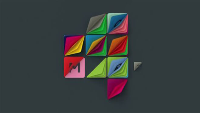
I’m well known in the studio for my love of all things geometric, so it’s obvious why I have a soft spot for this wee dreamboat.
Besides the look of it though, this rebrand perfectly demonstrates how to get a message out there.
More4 was becoming more of a ‘lifestyle’ channel, with content showing us how to be creative – restoration.. fashion.. cookery.. and the previous logo wasn’t standing well alongside this.
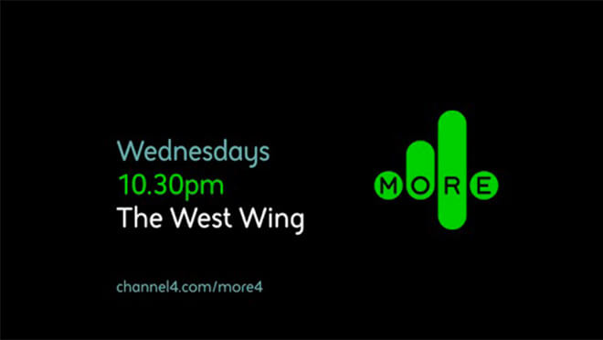
It’s still a good-looking logo, it was a bold and uncompromising brand that worked with More4’s original, more ‘grown up’ content and ambitions, but the shift in the content of the channel cried out for a new look.
Alongside this new style of content, More4 had an upcoming launch of a ‘scrapbook’ service, where viewers could go online to ‘cut out and keep’ their favourite ideas from the shows.
The rebrand also pulled from this upcoming service to adopt its ‘flipping’ movement style – resembling flipping through the pages of a book.
This style is best seen in action:
The studio behind the rebrand, ManVsMachine, perfectly summed up the importance of consideration at all times of how a brand will be used;
“When we’re designing for a TV channel, we design a logo with a vision of how it’s going to move. It’s used as a still logo 10% of the time at most”
This understanding on movement plays a huge part in the beauty of this logo – even in the flat logo, the clever placement of shadows and highlights almost entices the viewer to flip over each 3D segment. This urge to get hands-on with it clearly hit the studio creators too, as they teamed up with Jason Bruges Studio to physically build and implement their little flippers in real locations..
These beautiful idents lovingly portray the ‘making things’ ideology behind More4’s new creative path. I take my hat off to everyone behind them for actually getting out there and doing it instead of computer generating all the magic – it really implements what the brand is all about.
The freedom the logo has to move, to be alive, to create a new look every time, ties in absolutely with More4’s new focus on creative content and the exciting array of colours also awakens creativity and imagination.
All in all – it’s an example of a foolproof rebrand that tells the story it’s supposed to tell.
Next in line is the ITV rebrand..
(this tv channel theme is unintentional)
This project followed some major re-organisation at the network, there were big changes staff wise and therefore approach wise. Their ambition was to turn ITV Creative into a respected, award-winning agency, starting with their own on-air content.
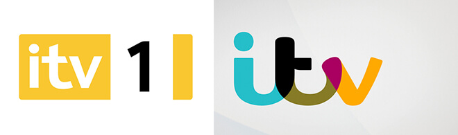
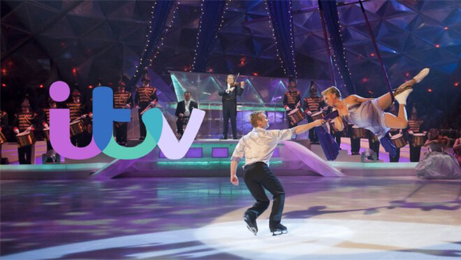
ITV provides hugely popular content that brings all sorts of people together, this stream of popular culture influenced the need for a more friendly logo. The soft, cursive font is more inviting and lively – the previous logo looked stagnant and boring.. definitely not that of a directional tv channel.
The more ‘fun’ approach to the logo however, was met with some debate over how it will deal appropriately with more serious content, such as the news..
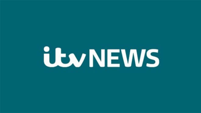
..I think it deals with it just fine.
Using only one spot colour gives it a more sombre appearance, but still keeps that soft, inviting appearance.
Not all news is bad news!
A big factor of the rebrand included the task of cementing the relationship in viewers minds between the shows and the ITV brand that produces and broadcasts them.
The solution to this is my favourite part of the brand..
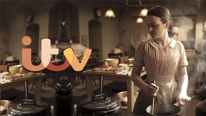
The on-screen logo will adapt to the tone and colour scheme of the footage being promoted using a ‘colour-picking’ feature.
This creates a brand which proudly shows the network’s content – fusing with the imagery to fit comfortably alongside the particular show rather than overpowering it.
The colours used in the main logo are picked from all over the spectrum, to hint at the ever evolving and adaptable colour scheme.
It works even better when seen in motion..
Lovely.
Both examples I’ve spoken about here have nailed the rebranding process.
How have they done it? Simple; they haven’t just slapped a new logo all over the place, they’ve put that all important message all over the place.
Ruth

Comments ( 0 )