In light of my recent hair chop, I thought it was only right to continue on the ‘makeover’ topic from my previous post…
You could say I’ve just went through my own personal rebrand, and I know first hand that the way to work it is to stay confident!
Adjustments, compliments and the dreaded backlash all come hand in hand with going through a change in appearance. Thankfully I haven’t had any backlash myself! But for big companies, it’s a given. Everyone has an opinion and when your brand is known worldwide.. that’s a lot of opinions.
One company that is met with a lot of undesirable opinions on their rebranding efforts is Pepsi.
Go on to any blog or forum that includes their most recent branding and you will scroll through a lot of objectionable reactions.
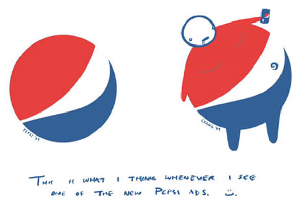
My favourite…
You’ll never be able to see anything but that fat guy now whilst browsing the soft drinks aisle.
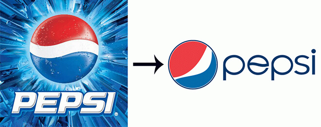
Personally, I prefer this new logo to their previous offering.
It’s a lot cleaner, fresher and friendly. Not so PEPSI in your face as the last one. I think the designers took it on the right path, in keeping the recognisable red and blue circular mark, but making slight changes to the white central panel and removing those questionable highlights. The ‘flowing’ language is emphasised here and also introduced nicely into the new slimline font.
This current logo has been around since 2008, 6 years later and still going strong – the onslaught of negativity hasn’t bashed their confidence… and good on ‘em!
When it comes to a rebrand, you’re never going to please everybody. There will always be differing opinions. It’s important to take notice of every reaction – I’m not telling anybody to be deluded and ignore all negativity while reaping in the positives – but if you are confident enough in how you are portraying yourself and your company isn’t sliding down the slippery slope of ruin, then rock that new look!
Ruth


Comments ( 0 )