Design is never a fixed path. It twists and bends, branching off into different areas and adapting to its surroundings. In this sense, there is no ‘right or wrong’ within design, but a gut feeling that tells you that you’re heading in the right direction.
We met Stan, the founder of a company called Disruptancy. It was a very successful business; expanding it’s client base, continually working on new ideas. But something struck me as peculiar; it had lasted 10 years without any form of branding.
As we live in the information age, branding plays a crucial part to any successful business, yet Stan’s seemed to defy logic on this part. How could a company hold up against it’s competition for 10 years without any recognisable marks that are tied to the title?
Disruptancy works business to business. Organisations come to Disruptancy for a number of reasons — but usually to employ disruptive practises and methodologies to scale or turnaround.
We felt it was important to get to know Stan as a person for this exercise, because you could almost say that he was the current branding of Disruptancy. A lot of his clients came directly to his company not because of advertising, but through word of mouth and a trustworthy founder. The branding would be very personal to Stan and represent his idea of what the company stands for.
We began mind-mapping from a select list of words Stan had used to summarise the business. The mind mapping lead us to some interesting themes:
Integration / The journey / Creative pathways / Fluid movement / Turnaround / Expansion / Adaptation / Evolution / Growth of a business / Personalised service / Company code
This section of the design process is always energetic; a lot of very initial thoughts with accompanying pathways. No idea has been anchored down to the ground so there’s always a feeling of continual momentum and fluidity.
These words lead us onto research, pulling inspiration from numerous sources; sculpture, architecture, art, print design.
To convey to companies ideas and legacy, this key was crucial to the success of the branding. As long as the idea had potential, it was pinned up on the wall. As the wall began to fill, it was becoming more and more apparent that the team was all on the same track.
Themes began to naturally emerge, so it was time to categorise them. We collected the initial research in to piles based on their similarities. These similarities weren’t necessarily simply aesthetic, it was more conceptual ideas that tied them together.
After collecting and arranging, we discussed again in detail what the company stood for, what message they wanted to show the world. A good technique for this is summarising the companies themes in as few a words as possible. This then led us on to creating specific names for each concept our research had brought to us.
Conceptualisation was made a lot easier due to our initial research and theme building stages. Any form of sketch that was created was then pinned up (as rough as it may be). In many cases, if I drew a sketch that I wasn’t happy with, another team member may find some inspiration in it, leading us onto greater ideas. We’ve found that it’s always a good idea to put up every idea you have, as small as it may seem.
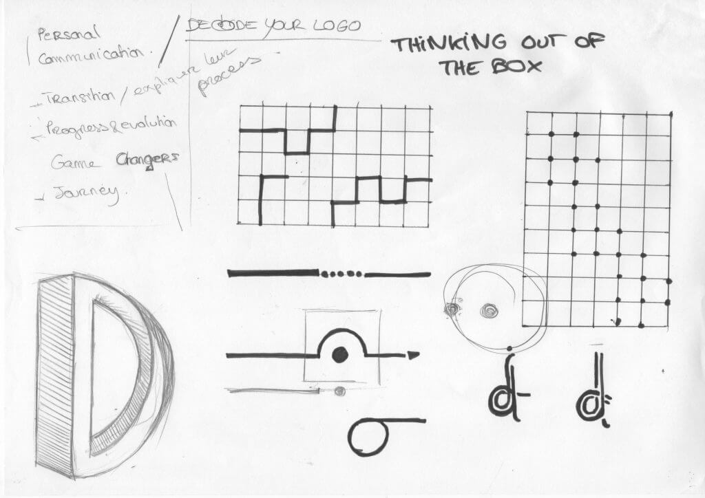
The presentation is dependant on the brief; with this brief, we wanted to present our concepts in a way that highlighted particular traits of our clients company. We chose to recreate the ‘journey’ aspect, and pinned up our concept on the wall, linking them together with red string.
Now that the initial concepts had been created, we felt it was time to bring our client back in to the studio to show the journey so far. After a brief explanation of each concept, we asked and answered questions regarding the ideas. Keeping an open communication is key to a successful project, especially in the early stages.
There were a couple of concepts that really stood out to Stan, one of them being ‘The Möbius Strip’ concept. I explained to Stan that a Möbius Strip is a mathematical object that has one side and one edge, known as being non-orientable. It can be recreated by taking a thin piece of paper, writing it once in the middle, then gluing the ends together. If you take a pen and draw a line down the path, it will cover all faces of the strip, meaning it has one side.
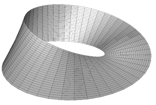
But how does this relate to Disruptancy? Well, there were multiple connections that I found between Stan’s company and the mathematical shape:
A strip winds and bends, yet only has one side and one edge
— Disruptancy adapts based on it’s clients, yet only has one objective
A literal 180 degree flip
— The company is flipped on it’s head, with a new outcome
Any object that travels down the strip will arrive at the starting point inverted
— Endless possibilities at the end of the process
Cutting the strip down the central axis results in a larger strip; the strip expands outward and has obtained extra twists
— By disrupting clients’ companies, a dramatic change has been made, only to result in the growth of the business
Stan could see potential in this concept, so we took it forward and began developing this idea. A very important part of this stage is not losing the core meaning of the concept by covering it in an aesthetic facade. Always ensure that the developed idea fits within the mould created by that spark that started the journey.
The comparison of these connections to the initial themes we had thought of was interesting. As the concept begins to take shape, each point that it expresses is refined and sharpened. There were no longer any unanswered questions about the brand, myself and the team could confidently answer any questions regarding the meaning of the logo, ensuring a very clear message is sent across.
The team were very happy with the final design, as we could all agree that it summarised what Disruptancy was all about in a simple mark.
![]()
I feel that myself and The Loft have learned from the entire process of creating Disruptancy’s branding. I know now not to through away any ideas, because even the most ridiculous will have depth to them. To be honest, it’s usually the most ridiculous that are the most successful. Always stay true to that concept as it is so easy to take it on another path. Working close with the client and building a trusted relationship is key too, is it gives you as a designer freedom to make decisions based on your training and knowledge. Always be abstract and creative, never stop pushing to create something you and the client are proud of.