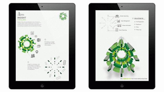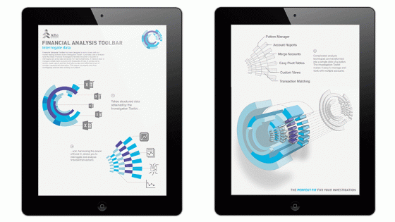
BRIEF
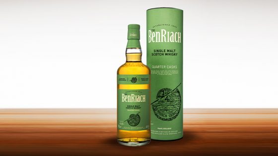
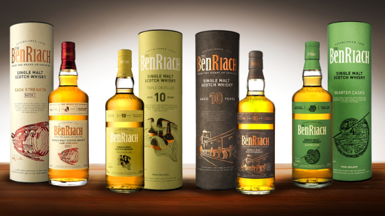
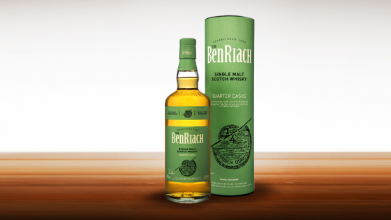
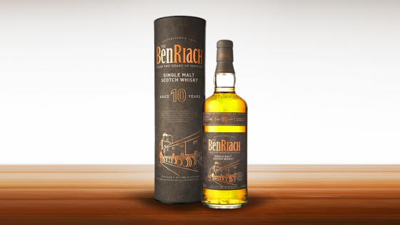
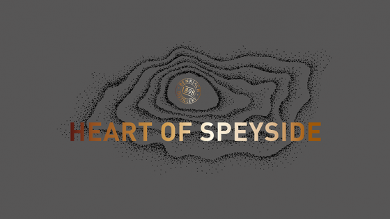
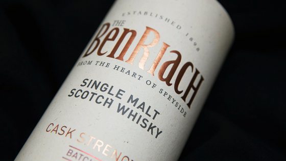
BenRiach are one of the largest and most famous whisky distilleries in the renown Speyside region of Scotland. We’ve worked with the organisation for a number of years and were delighted to be given the opportunity to design the packaging for their first ever ‘Cask Strength.’
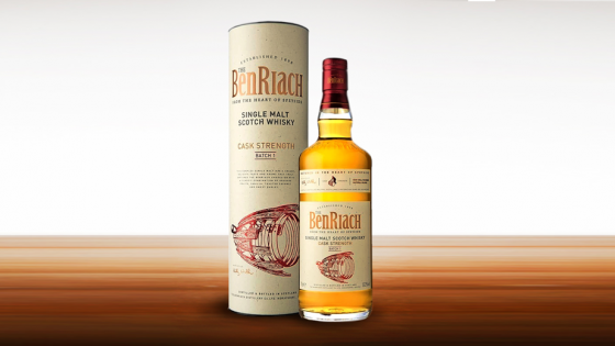
The new whisky, bottled straight from the cask, would be one which delivers an intensity leaving even the most passionate whisky lover looking for a little water.
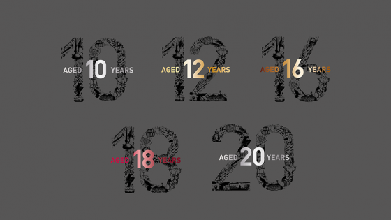
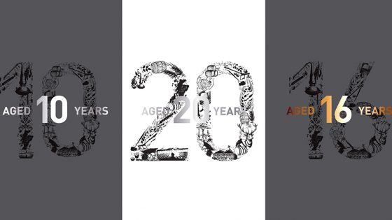
BenRiach were looking for a bold design which would lead the way with future expressions and they were also looking for ‘Peated’ and ‘Non-Peated’ versions too.
SOLUTION
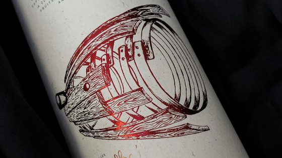
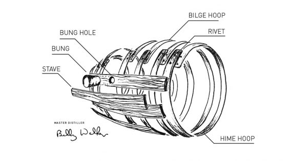
We were inspired by BenRiach’s desire for more excitement and our main idea was to showcase an exploding cask, one which was quite literally blown apart by the strength of what’s inside.
We pushed the limits of this concept by dramatising the perspective of the final illustration. Bronze foiling, distinctive colour matches and a speckled paper print all added to the visual drama.
The final design is tactile, rich and another step forward for the brand.
RESULT
We were delighted with the final results as were BenRiach.
“What a wonderful result. For the BenRiach Cask Strength, it was really important for us that the design would be bold and imaginative. We were looking for a striking, memorable design that would take the brand, the range to the next level and we got it. We are delighted with the final outcome as well as the services provided by the loft.”
Louise Seaward, Global Innovation Manager for Brown Forman