Re-Imagining Electric Power
Construction & Industrial Machinery Brand Positioning
How the creation of a new concept livery ‘inspired by powerful storms’ gave New Holland the opportunity to transform it’s brand positioning for electrification in the ultra-competitive construction and industrial machinery market.
Brief
New Holland are one of the world’s leading machinery & equipment producers. Over several years, the iconic brand has begun to electrify their agricultural and construction machines. With many of their competitors following suit, the organisation wanted to take a leadership role in their sector. We were asked to produce a ‘fresh and different take’ on how to present ‘electric power.’
The creative work produced would be shown on the New Holland stand at the annual Agritechnica Show, in Hanover Germany. And, also play a part in ‘parent company’ CNH Industrial’s brand, marketing and communications for ‘electric power.’
Results
Our collaboration delivered truly exceptional results. These included…
– Outstanding brand recognition for New Holland, hosting two of the show’s undoubted stars, at Agritechnica 2023.
– The Bolstering of New Holland’s reputation, globally, as a true technology leader.
– Wide-ranging critical acclaim for the New Holland brand and their new ‘visual direction.’
– Access to new options creatively for both the New Holland and CNH Industrial’s brand, marketing and creative teams.
The work produced, received a prestigious ‘Chicago Good Design Award for Transportation’ in late 2024. >>>>>
How These Results Were Achieved?
We created a bold, unique and class-leading visual direction. This was inspired by ‘powerful storms,’ beautifully reflecting the exceptional levels of torque produced by ‘electrification.’
Services Used
Brand Strategy | Creative Direction | Branding | Graphic Design | Design for Print
The Project in Greater Detail
The highlights of our work together included…
Design Innovation
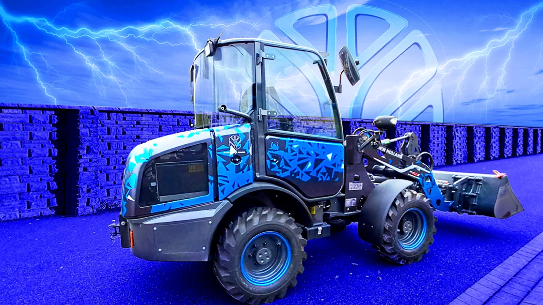
As stated, real brand leadership came from outstanding design innovation. We moved away from traditional ‘electric’ styling features to use more adventurous themes inspired by electrical circuit-boards, lightning strikes and (the selected option) ‘high-velocity storms.’ Our cutting-edge theme-generation processes gave us a much richer variety of visual styles to explore.
Show Machines
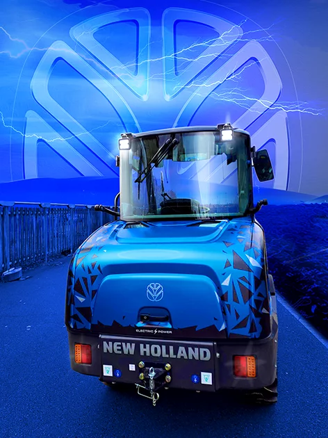
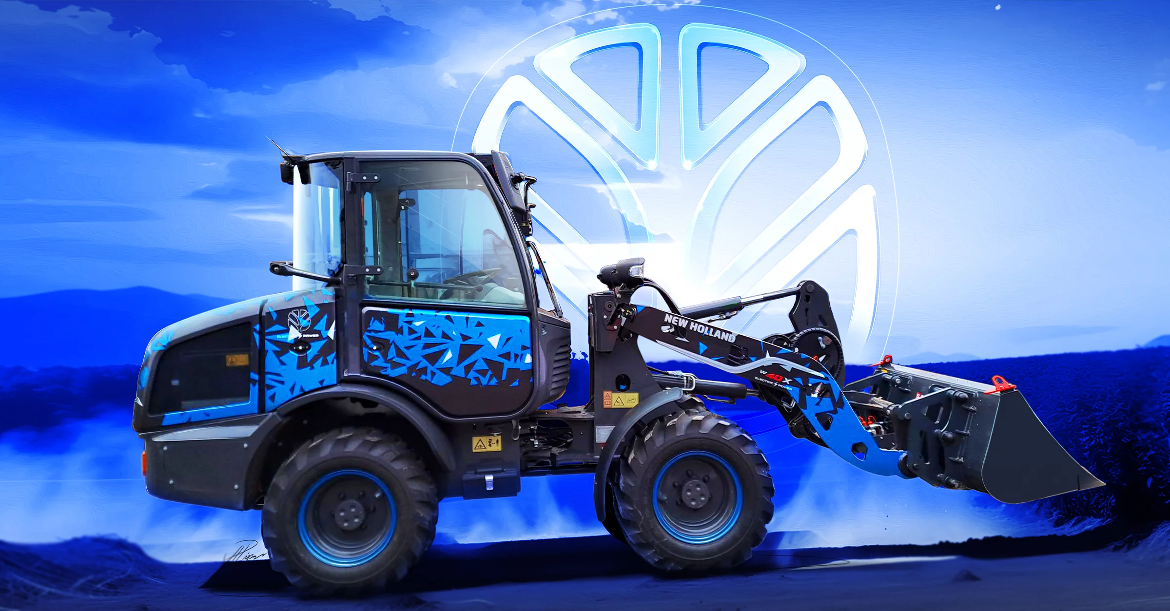
The New Holland brand was enhanced greatly with the creation of two new show stars for Agritechnica. These were the New Holland W40X Tractor and E25X Excavator. Both machines wore the new livery and drew significant attention. This reinforced the brand’s leadership in the category.
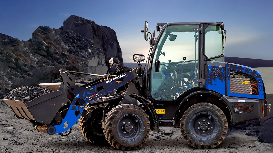
Showcasing New Holland Construction’s ‘Electric Blue’
‘Electric Blue’ was chosen, both, for its potency and, also, as it represented the New Holland ‘Construction’ brand.
Additional Conceptual Explorations
As part of the exploration phase, many additional concepts were created. These directions cannot be shown in this, particular, case study. However, they did play a critical part in the development of the final outcome.
Award Winner
As mentioned, this work was awarded a prestigious Chicago Good Design Award for Transportation in December 2024 >>>>>
Similar Projects
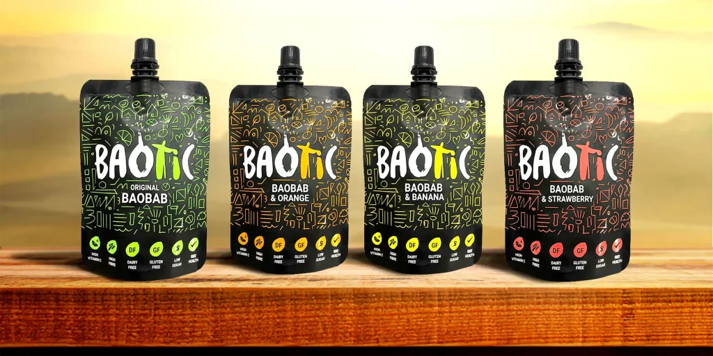
Drink Baotic, Engineering ‘Wow-Factor’
Retail Brand Development >>>>>
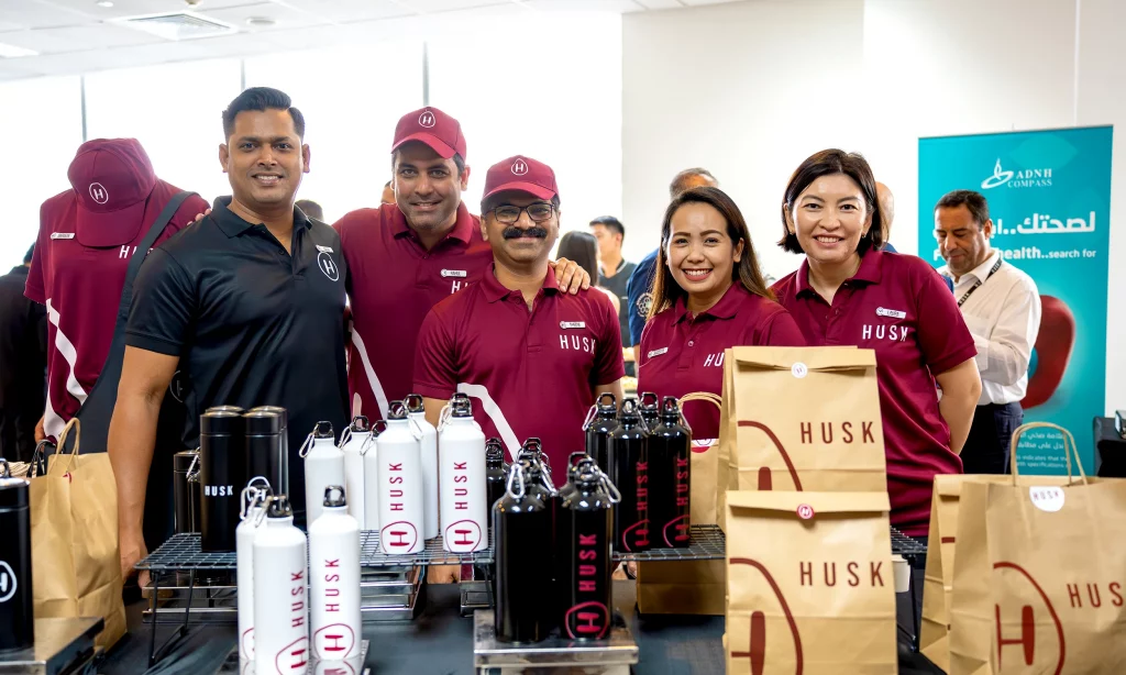
ADNH Compass, Prioritising ‘The Important’
Rapid Retail Brand Launch >>>>>