Celebrating ‘The Artisans’
Repositioning a Premium Whisky Brand
How the creation of several beautifully crafted and outstandingly detailed packaging designs transformed the perception of BenRiach in the international marketplace.
Brief
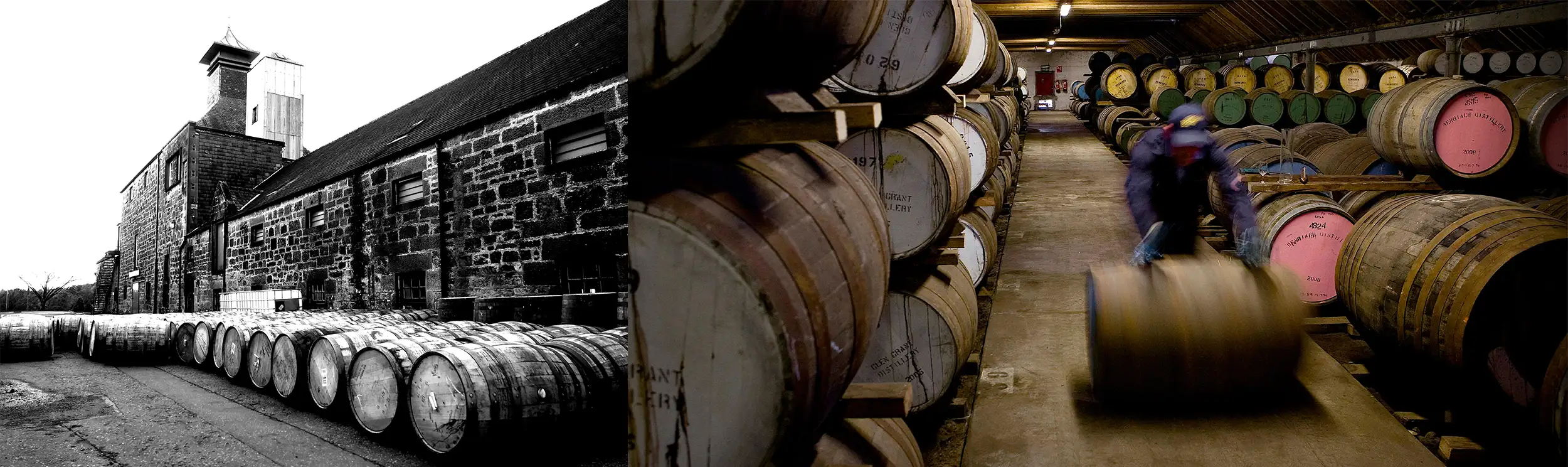
BenRiach are a whisky distillery based in the renown Speyside region of Scotland. Founded in 1898, the distillery has an outstanding reputation for creating incredibly characterful whisky expressions. These are based on an eclectic mix of casks from all around the world.
The organisation was celebrating a decade under new ownership and looking to significantly expand their organisation commercially. As a result, they were looking to take the brand up another level in terms of presentation, professionalism and overall impact. Ultimately, they wanted to better compete with other premium whisky brands in their sector.
Results
We worked extremely closely with BenRiach, for close to 5 years, achieving some outstanding results. Our work to reposition the Speyside brand helped the organisation to…
– Open-up several important new markets, for the brand, domestically and internationally.
(This included the commercially important ‘international duty-free’ market.)
– Significantly improve ‘on-the-shelf impact’ of their whisky expessions with traditional retailers.
– Increase the perceived value of the brand with prospective and existing customers.
– Revitalise and reinvigorate the BenRiach brand in the eyes of customers, distributors and supporters.
– Increase shareholder value on-exit.
BenRiach was sold to US giant Brown Forman in 2016.
How These Results Were Achieved?
We worked closely with BenRiach to create a wide range of new expressions that put ‘beautiful craft’ at the heart of their brand presentation. These were significantly bolder and truly celebrated the outstanding artisanship of the distillery and its people.
Services Used
Brand Strategy | Brand Storytelling | Traditional Advertising | Creative Direction | Packaging Design | Graphic Design | Illustration

Our Collaboration in More Detail
The highlights of our work together…
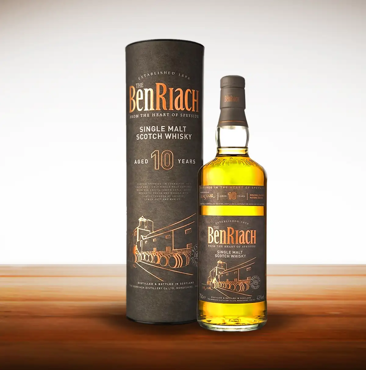
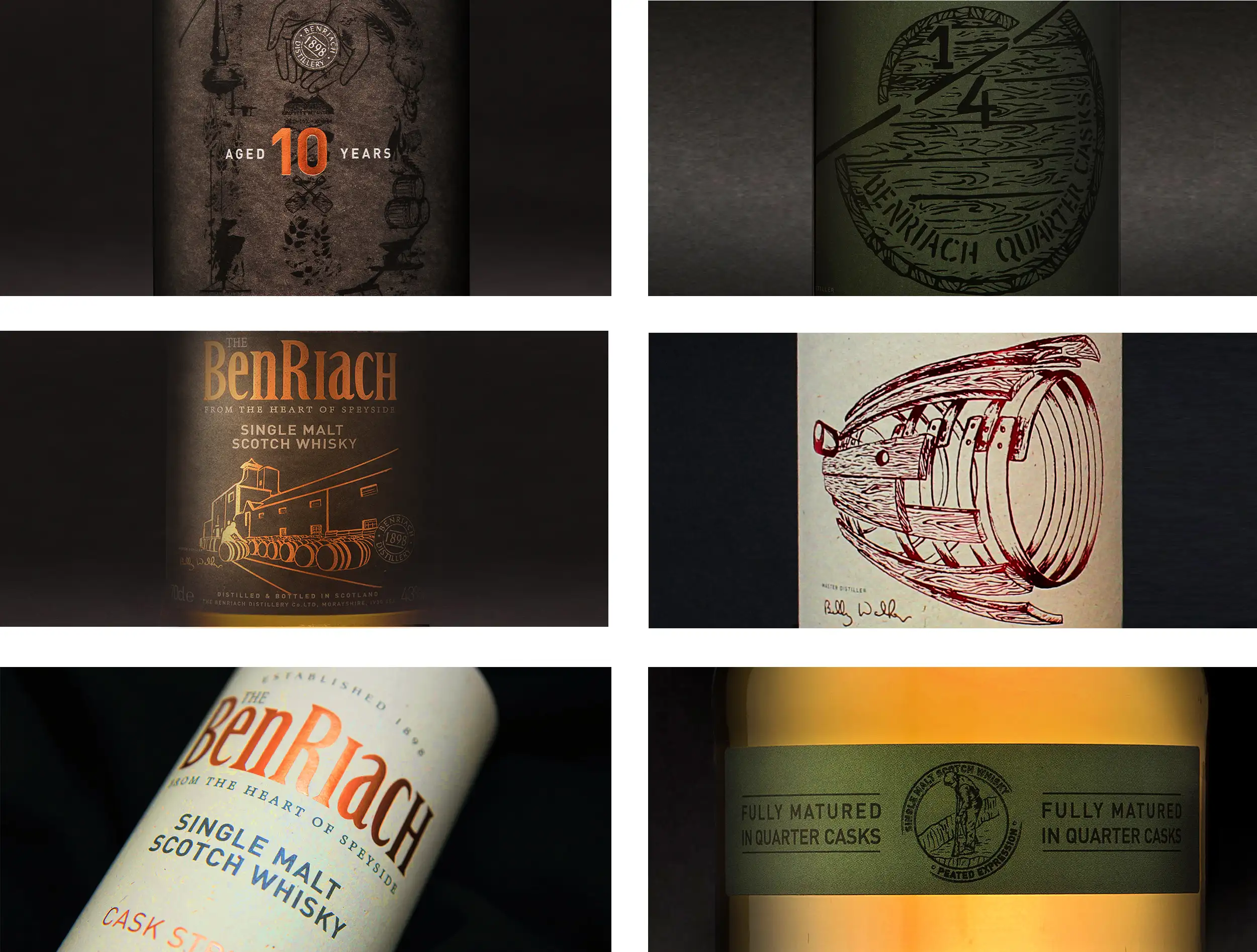
‘The BenRiach Ten,’ Bronze Ink on Gunmetal Grey Card
The first piece of work in our collaboration with BenRiach. The design featured a highly distinctive line drawing of the distillery using a bold bronze foil off the backdrop of a gunmetal grey card.
![]()
“The BenRiach 10-Years-Old is a key launch for us, as it marks a significant milestone; it is the first core range expression to be created predominantly from whiskies distilled at BenRiach since we took over in 2004. For this reason, we were looking for a striking new packaging design to reflect this important moment in the distillery’s history. We are delighted with the final result.”
Nicol Van Rijbroek, Marketing Manager for BenRiach
![]()
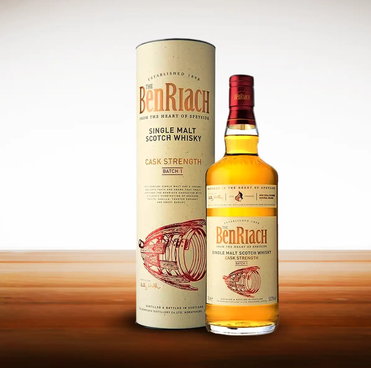
‘The BenRiach Cask Strength,’ Exploding Cask Illustration
The centrepiece of the ‘BenRiach Cask Strength’ was a textured pen drawing of an exploding cask. This illustration was once again supported with speckled card selections and an ultra-bold collection of red and bronze foils for various details.
![]()
“What a wonderful result. For the BenRiach Cask Strength, it was really important for us that the design would be bold and imaginative. We were looking for a striking, memorable design that would take the brand & the range to the next level and we got it. We are delighted with the final outcome as well as the services provided by THE LOFT.”
Louise Seaward, Global Innovation Manager for Brown-Forman
![]()
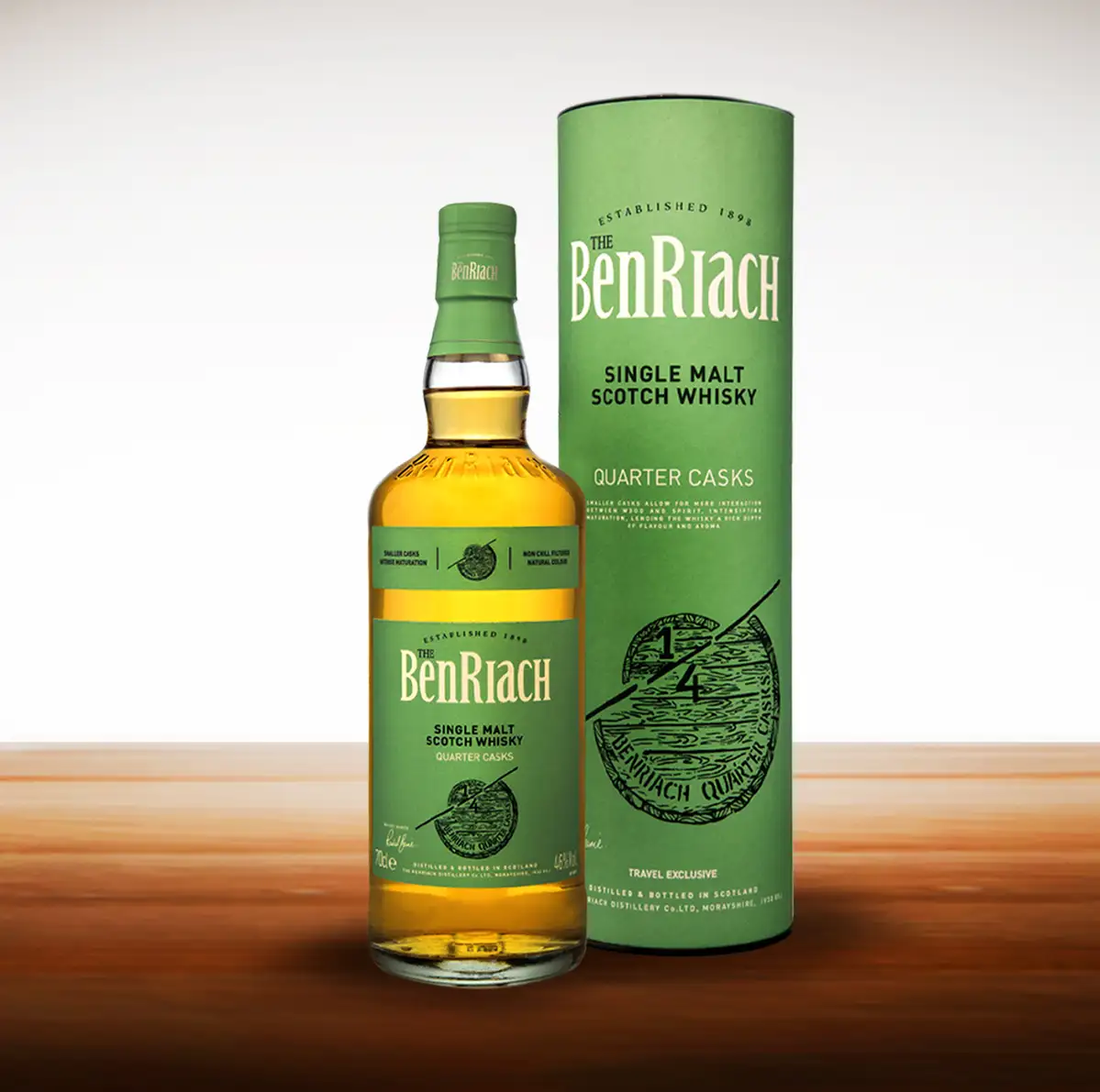
‘The BenRiach Quarter Cask,’ Fresher Colours
Created alongside the ‘Cask Strength,’ the ‘BenRiach Quarter Cask’ kept up the main style with a beautifully crafted illustration of two casks – one a quarter the size of the other. The illustration was complimented with a beautiful green card being used to showcase the fresher taste of this distinctive whisky expression.
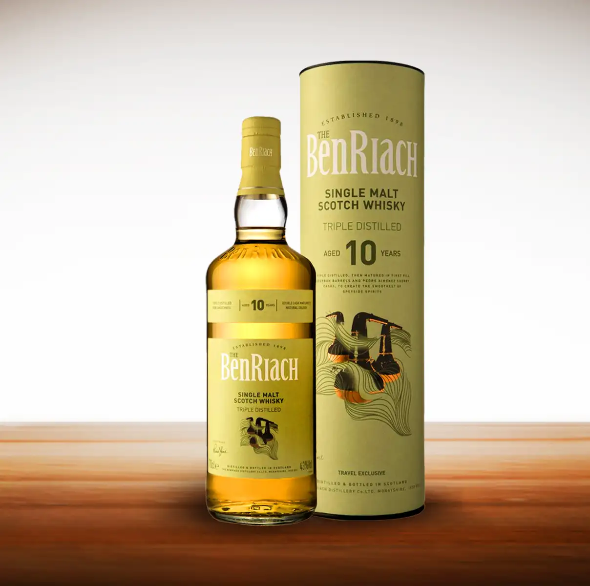
‘The BenRiach Triple Distilled’: Plethora of ‘Beautiful Craft Techniques’
The final design in this particular series, ‘The BenRiach Triple Distilled’ was the most flamboyant of all the expressions created.
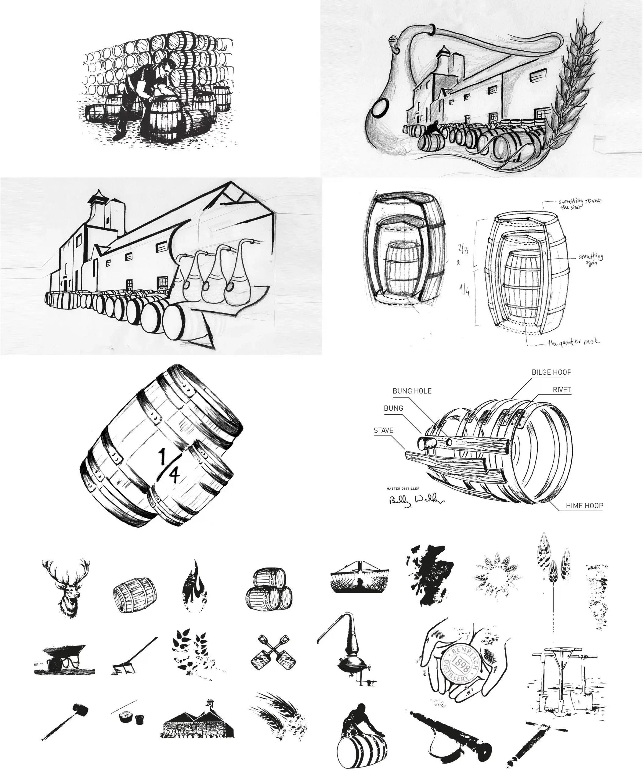
The packaging design featured the three stills from the distillery re-created in the most incredible illustration. The number of print techniques included multiple foil presses of copper and silver foils alongside line-embossing and gradient ink-edging. An incredible technical and production feat.
Achieving such a complex finish required the absolute highest levels of skills from all involved, our designers spent several days on-site with the printers to ensure such a beautiful finish.
Exquisite Detailing
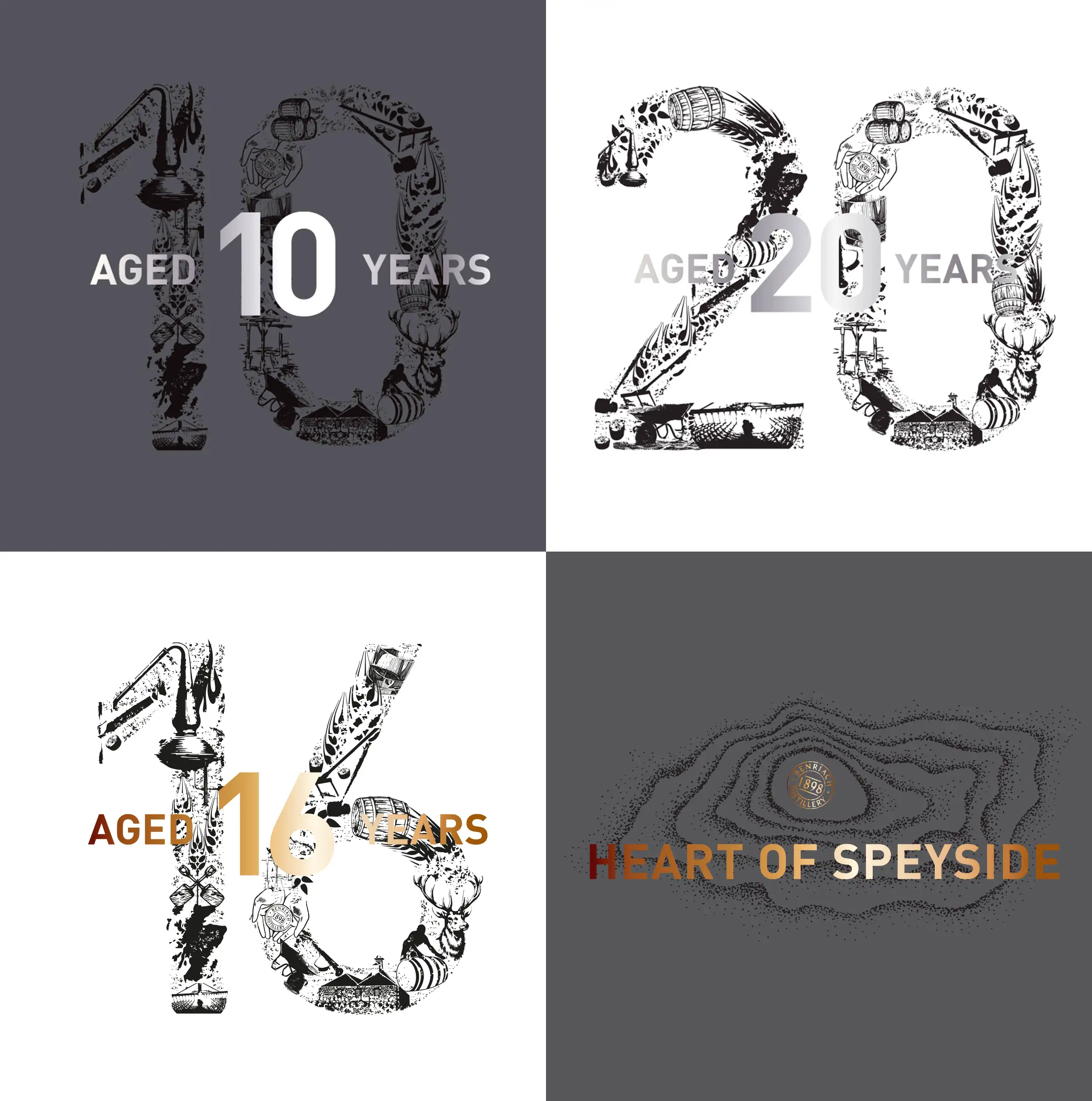
Throughout our collaboration, we created a wide range of beautifully detailed features to emphasise the ‘commitment to craft’ – these included the main illustrations, age numbers, accreditations and a full newly created icon-suite for BenRiach to use at their own discretion.
Using Paper Mock-Ups
Understanding of design Ideas and quicker decisions were both made possible thanks to the paper mock-ups we created in each and every expression for BenRiach. These rather pretty creations became a key and very helpful part of the process for everybody involved.
Wider Marketing Support
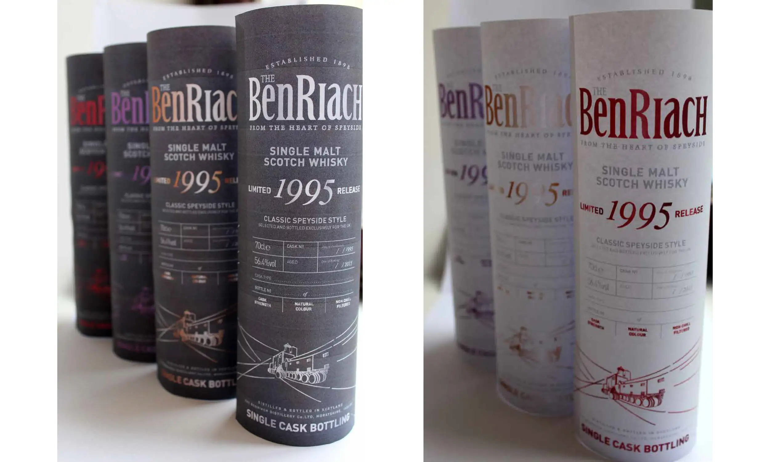
There were further expressions, including several un-released concepts.
Our collaboration took another interesting twist after the acquisition of the organisation by Brown Forman who brought a more storytelling approach to the brand.
Naturally we were delighted to assist, working for BenRiach and other associated brands Glenglassaugh and Glendronach.
Similar Projects
Drink Baotic, Engineering ‘Wow-Factor’
Retail Brand Development >>>>>
New Holland, Re-Imagining Electric Power
Construction & Industrial Machinery Brand Positioning >>>>>