We recently rolled out an exciting brand identity for the new and innovative Fridge Angels, a Glasgow-based company who offer fully comprehensive sales and servicing packages for refrigeration and air-conditioning needs.
Working closely with the director, John, we developed an identity for the business that has positioned it at the forefront of the industry in Glasgow and the surrounding area.
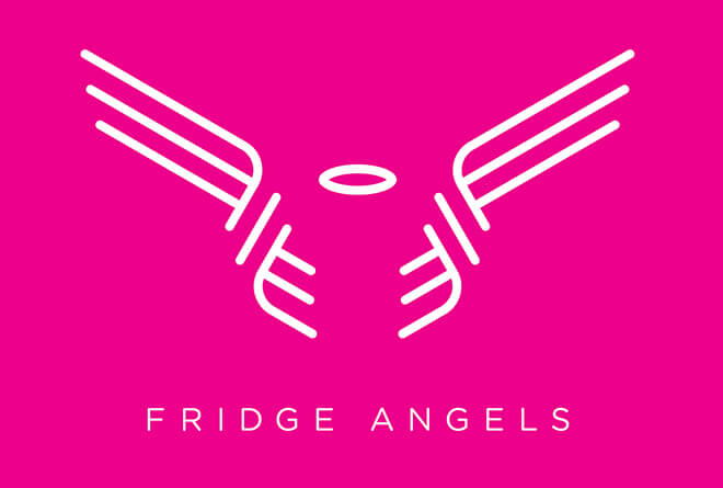
Taking inspiration from the inner workings and cooling cycle of the refrigeration and air-conditioning units — coupled with John’s huge emphasis on customer care — we developed a logo which communicates the message of the company ‘wrapping around’ the customer’s every need.

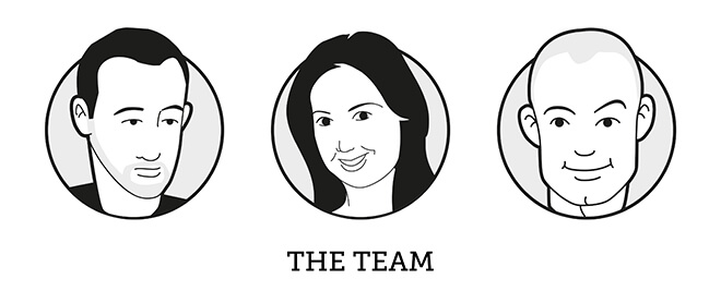
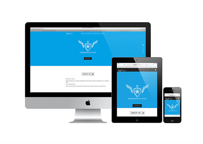
We used sophisticated, curved lines to hint at angel wings that wrap around the halo—representing the customer—in the centre. We furthered this concept with the use of warm, friendly, and inviting colours — which also worked well to position the company away from others in the industry. Along with sophistication, there’s a huge element of fun thrown in for good measure. This comes across really well on the new website where we’ve used a mix of bold colours, original icons and even cartoon versions of the Fridge Angels team.
This was my first project at the loft and I must say, it was a really fun and rewarding project to complete. The whole team here at the loft worked really hard to complete the project for John, who was the perfect client and knew exactly what he was looking for—and also brought Prosecco to toast the completion, which is always appreciated! I hope to work with John and the Fridge Angels team in the future.
Eamon.

Comments ( 0 )